
Formosa Floors

Formosa Floors Type: Premium SPC Flooring Brand Objective: Build a distinct identity and establish brand presence in a competitive flooring market through comprehensive branding, digital presence, and a robust marketing strategy Target Audience: Homeowners, interior designers, architects, and real estate developers Challenges Faced New Brand, Zero Awareness:Formosa was entering a saturated market with no prior digital or offline presence. Lack of Brand Identity:There was no logo, tone of voice, or visual guide— a complete brand build was required.Premium Offering, Low Familiarity:While SPC flooring is high-quality, the general audience was unfamiliar with its features and benefits. Highly Visual Industry:The brand needed to establish trust and aspiration in a segment driven by aesthetics and functionality. Meraki’s Solution End-to-End Branding:Developed a strong and luxe brand identity with a modern logo, refined typography, and a sophisticated visual palette to reflect Formosa’s premium positioning. Website Design & Development:Created a sleek, intuitive website that not only showcased products beautifully but also educated users about SPC flooring and its advantages. Social Media Launch & Strategy:Built their social media presence from scratch — with content pillars focused on product education, design inspiration, behind-the-scenes processes, and installation highlights. Visual Language:Focused on warm, homely visuals paired with clean, editorial design to appeal to both homeowners and professionals in the interiors space. Content Marketing:Developed engaging content formats including transformation posts, expert tips, and moodboard-style layouts to build aspiration and awareness. Impact Formosa Floors successfully transitioned from a new entrant to a recognizable name within the interiors community. The brand saw steady growth in engagement, inquiries, and collaborations — with a growing audience of design professionals and homeowners actively exploring their offerings. The cohesive visual identity and strategic online presence positioned Formosa as a premium, trustworthy choice in the SPC flooring category. https://merakidesign.in/wp-content/uploads/2023/11/Formosa-Logo-animation-v4.mp4https://merakidesign.in/wp-content/uploads/2023/11/v.mp4 https://merakidesign.in/wp-content/uploads/2023/11/posts.mp4https://merakidesign.in/wp-content/uploads/2023/11/Formosa-Book-Video-1.mp4
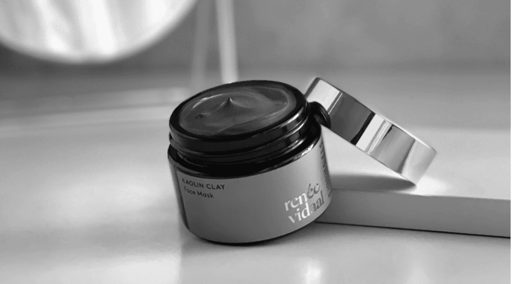
Renee Vidaal
The quirky and fascinating logo designing, branding and labelling of Tangy Tongue, a delectable Schezwan dip.
Maa-Corporate
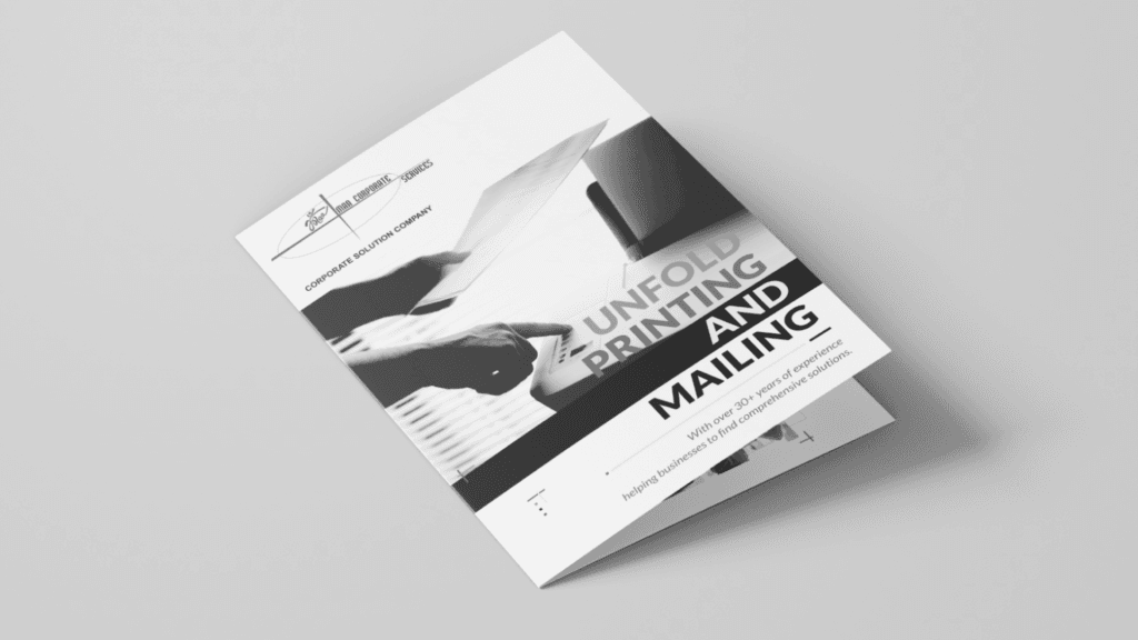
Maa Corporate Services Type: Printing and Mailing Company Brochure Objective: Editorial Brochure Design Target Audience: Corporate clients and businesses requiring printing and mailing solutions With over 40 years of expertise, Maa Corporate Services sought a brochure that captured the essence of their longstanding legacy in the printing industry. Challenges Faced Preserving Tradition: Designing a brochure that reflected the company’s rich history while also staying relevant in a modern context. Visual Balance: Balancing a vintage aesthetic with a contemporary touch to appeal to both traditional and modern clients. Showcasing Expertise: Effectively highlighting their printing expertise within the design, ensuring it resonated with their brand identity. Meraki’s Solution We crafted a tri-fold brochure with a vintage visual aesthetic, featuring black-and-white images from their factory to reflect the company’s legacy. To balance this, we incorporated a vibrant CMYK color palette as an ode to their renowned printing services, blending history with a modern, dynamic appeal. Impact The editorial brochure successfully communicated Maa Corporate Services’ legacy and expertise, helping to reinforce their position as a trusted name in the printing and mailing industry. It resonated with both existing and potential clients, effectively blending tradition with modern design elements.
Bombay98

Bombay 98 & RCR Realtors Type: Real Estate Brand Identity Design Objective: Creating distinct visual identities for both Bombay 98 and RCR Realtors Target Audience: Real estate buyers, investors, and property developers Bombay 98 and RCR Realtors, a renowned real estate duo, entrusted us with creating impactful brand identities that resonate with their audience and elevate their market presence. Challenges Faced Establishing Credibility: Ensuring the brand identities conveyed trust and reliability, critical for success in the competitive real estate market. Appealing to Target Markets: Designing logos that align with the brands’ individual ethos while appealing to a sophisticated real estate clientele. Meraki’s Solution Bombay 98: For Bombay 98, we incorporated a flowy script font with typographic play that emphasizes credibility and trust. The design focused on boosting the brand’s market perception. The graphic element of the logo is derived from the structure of a house, which is facing upwards to symbolize success and prosperity. RCR Realtors: For RCR Realtors, we crafted a classic typographic monogram combined with a circular emblem that pays homage to Feng Shui principles. The intertwined initials symbolize the brand’s years of experience, forming a cohesive and recognizable identity. Impact Both brand identities successfully communicated trust, experience, and market expertise. The distinctive visual direction helped Bombay 98 and RCR Realtors strengthen their individual market positions while also creating a cohesive unit that resonated with their audience.
Plum Goodness
The quirky and fascinating logo designing, branding and labelling of Tangy Tongue, a delectable Schezwan dip.
L’Amour
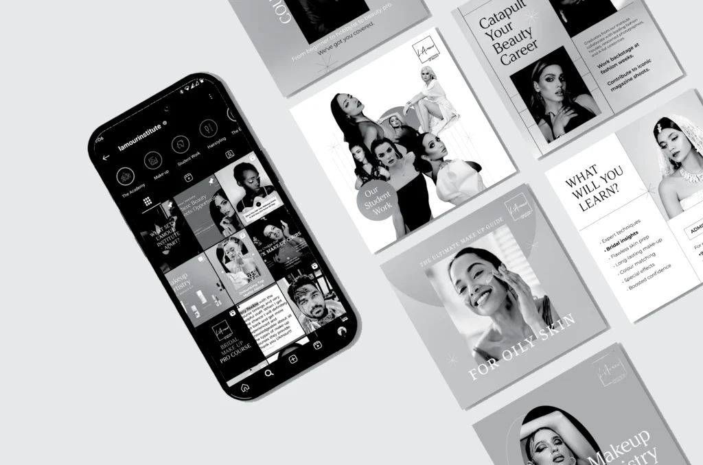
L’Amour Type: Beauty Training Institute in Dubai Objective: Refresh and elevate the brand’s digital presence to reflect its premium positioning and attract aspiring beauty professionals Target Audience: Aspiring make-up artists, hairstylists, nail technicians, and beauty enthusiasts across the UAE and beyond Challenges Faced Outdated Digital Presence:The existing online identity didn’t reflect the institute’s expertise or industry relevance. Lack of Cohesion:Visual elements, tone, and messaging varied across platforms, weakening the brand’s impact. Underrepresented Offerings:Courses and student achievements weren’t being showcased effectively, leading to missed opportunities for engagement and trust-building. Competitive Industry:Dubai’s beauty education space is crowded — L’Amour Institute needed to stand out with clarity and confidence. Meraki’s Solution Digital Identity Refresh:Redesigned the brand’s digital touchpoints with a luxe, modern aesthetic. Clean layouts, refined typography, and gradient blends reflected the textures of make-up artistry. Content Strategy & Execution:Built a cohesive content mix covering:– Course promotions that conveyed value– Student testimonials for credibility– Expert-backed tips & tricks for engagement– Behind-the-scenes moments and real student work to build authenticity Platform Consistency:Streamlined the look and feel across platforms, ensuring every post felt unmistakably L’Amour — polished, aspirational, and informative.Visual Language for Beauty Education:Created a unique style that balanced professional credibility with creative flair, appealing to young learners and working professionals alike. Impact The refreshed digital presence positioned L’Amour Institute as a go-to destination for beauty education in the region. The brand began drawing in more engagement from both students and mentors, fostering a growing online community of beauty professionals. The clean, compelling, and consistent content approach strengthened their authority, enhanced brand trust, and built lasting recall in a competitive market. https://merakidesign.in/wp-content/uploads/2025/02/1739524437467554.mp4 https://merakidesign.in/wp-content/uploads/2025/02/Make-Up-Artistry-Pro-Plus-VO.mp4https://merakidesign.in/wp-content/uploads/2025/02/LAmour-X-Bouba.mp4https://merakidesign.in/wp-content/uploads/2025/02/LAmour-Student-Work.mp4https://merakidesign.in/wp-content/uploads/2025/02/Make-Up-Artistry-Pro-Plus-VO.mp4 https://merakidesign.in/wp-content/uploads/2025/02/LAmour-Student-Work.mp4
July-Nightwear
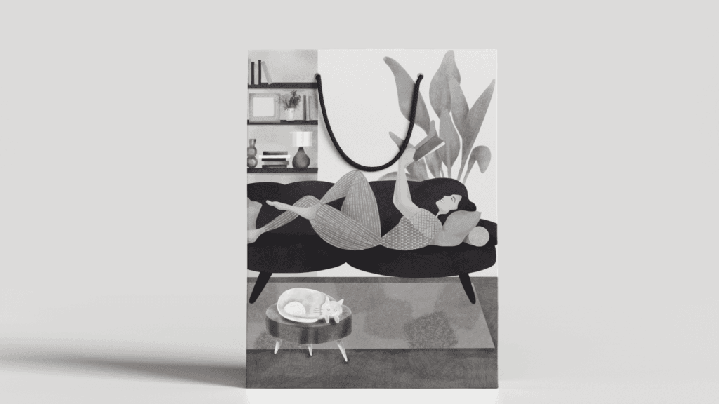
July Nightwear Type: Loungewear Brand Objective: Illustration and Packaging Design Target Audience: Individuals seeking stylish and comfortable loungewear July Nightwear aimed to capture the essence of their limited edition loungewear through a distinctive illustration and an immersive packaging experience. Challenges Faced Creating a Distinctive Brand Identity: The need to establish a unique visual identity that resonates with fans and reflects the team’s energy and passion. Merchandise Appeal: Designing exclusive merchandise that not only promotes the team but also attracts fans and builds community support. Meraki’s Solution Illustration: Developed a hand-drawn illustration showcasing the protagonist in their bestselling pajamas, embodying the luxury and comfort associated with July Nightwear. This design highlights the joy of cozy relaxation, making it relatable and inviting. Packaging Design: Sight: The playful illustration reflects themes of comfort and relaxation, instantly appealing to consumers and enhancing brand recognition. Touch: Opted for luxurious, reusable bags made from sustainable materials like jute, art linen, organic cotton, and organza, providing a sophisticated look and feel while promoting eco-friendliness. Smell: Included potpourri sachets within the packaging, featuring calming aromas of patchouli, oak, citrus fruits, and cinnamon, enriching the unboxing experience and promoting a sense of tranquility. Impact This holistic approach not only reinforced July Nightwear’s position as a provider of stylish and comfortable loungewear but also created a memorable, multi-sensory experience that resonates with consumers, enhancing brand loyalty and engagement. This purely hand-drawn illustration encapsulates the essence of our nightwear brand. Our aim was to evoke a sense of comfort through our design. Hence, we chose an illustration that represents a feeling that we can all relate to: The sheer joy of curling on your couch with your favorite novel after a long day, while your fuzzy cat sleepily purrs next to you. Can anything else be more relaxing? As a brand that provides the finest quality of comfort, we wanted our packaging to give our consumers a rejuvenating experience. We achieved this by designing a packaging that appeals to our 3 senses: Sight, Touch, and Smell. Our quirky illustration conveys themes of rest and relaxation. Upon viewing the cosy packaging, our consumers would be transported to a world where comfort is always #1. We decided to ditch conventional cardboard boxes and instead opt for luxurious bags crafted from materials like jute, art linen, organic cotton, or organza. The packaging also includes potpourri sachets. When our consumers open the package, they would be greeted by a warm embrace of patchouli, oak, citrus fruits, and cinnamon.