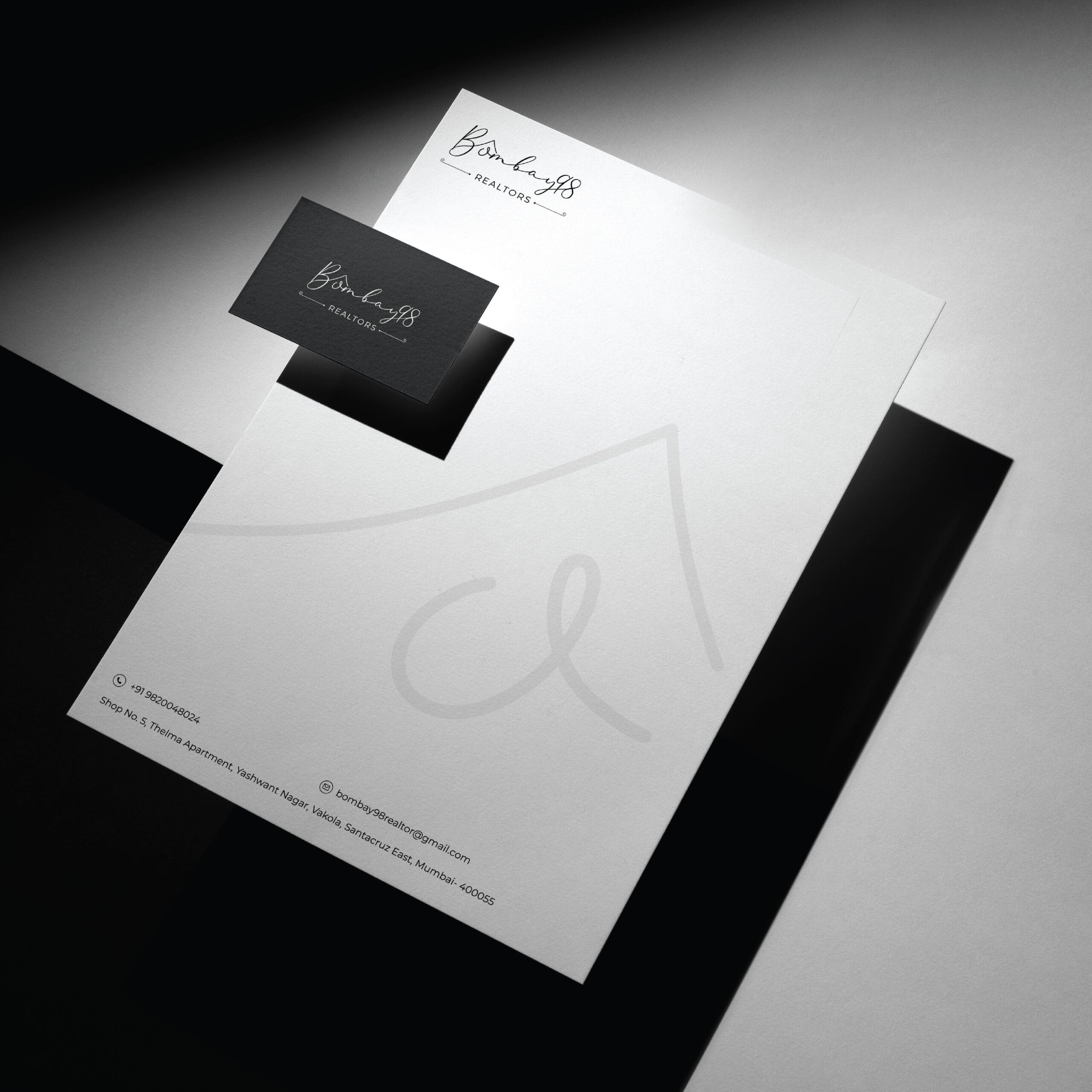
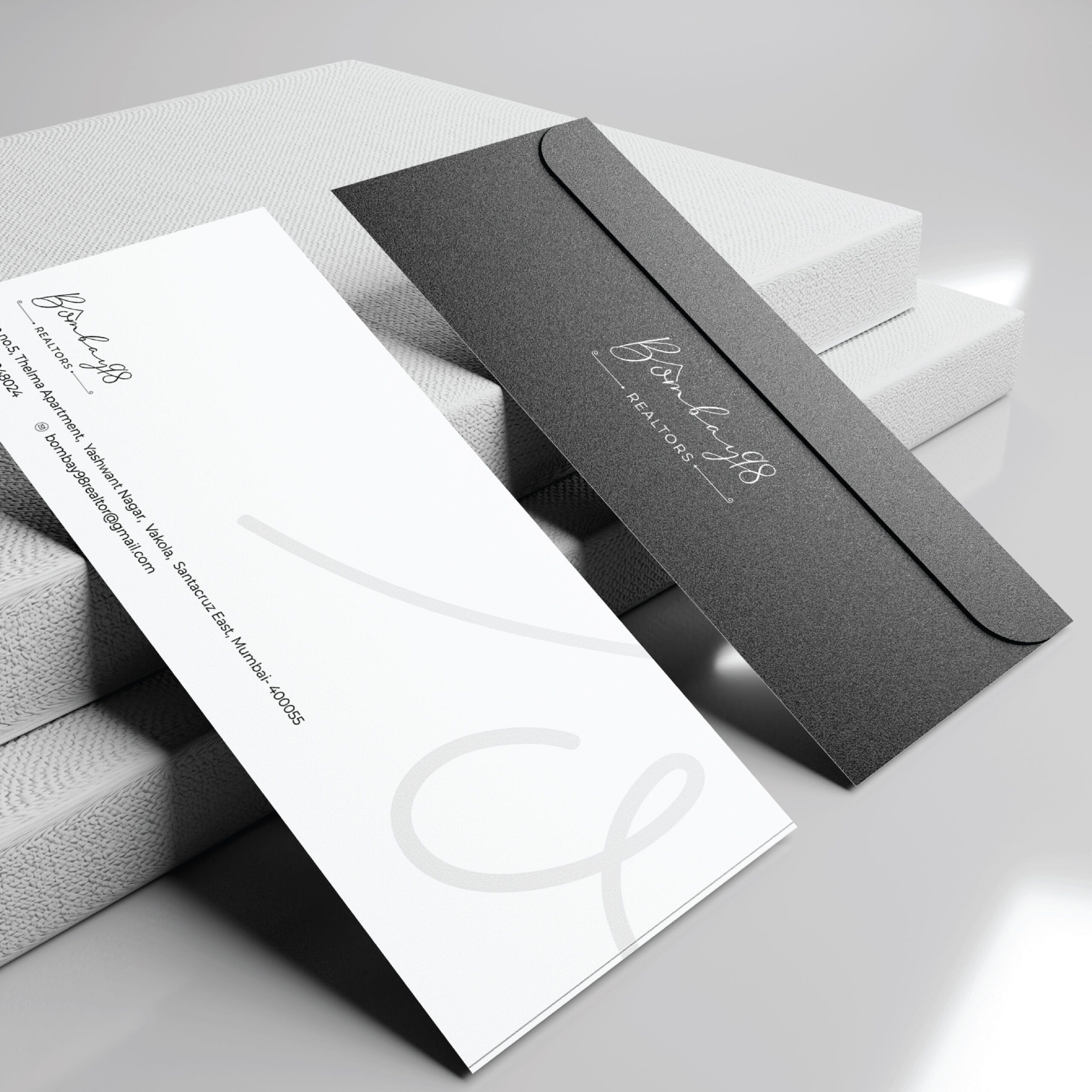
In real estate, a name has to carry a lot of weight. Trust. Ambition. Permanence. And in a category filled with familiar architectural symbols and formal identities, finding a way to communicate those qualities without simply looking like everyone else becomes an exercise in restraint.
Bombay 98 called for something with a little more character.
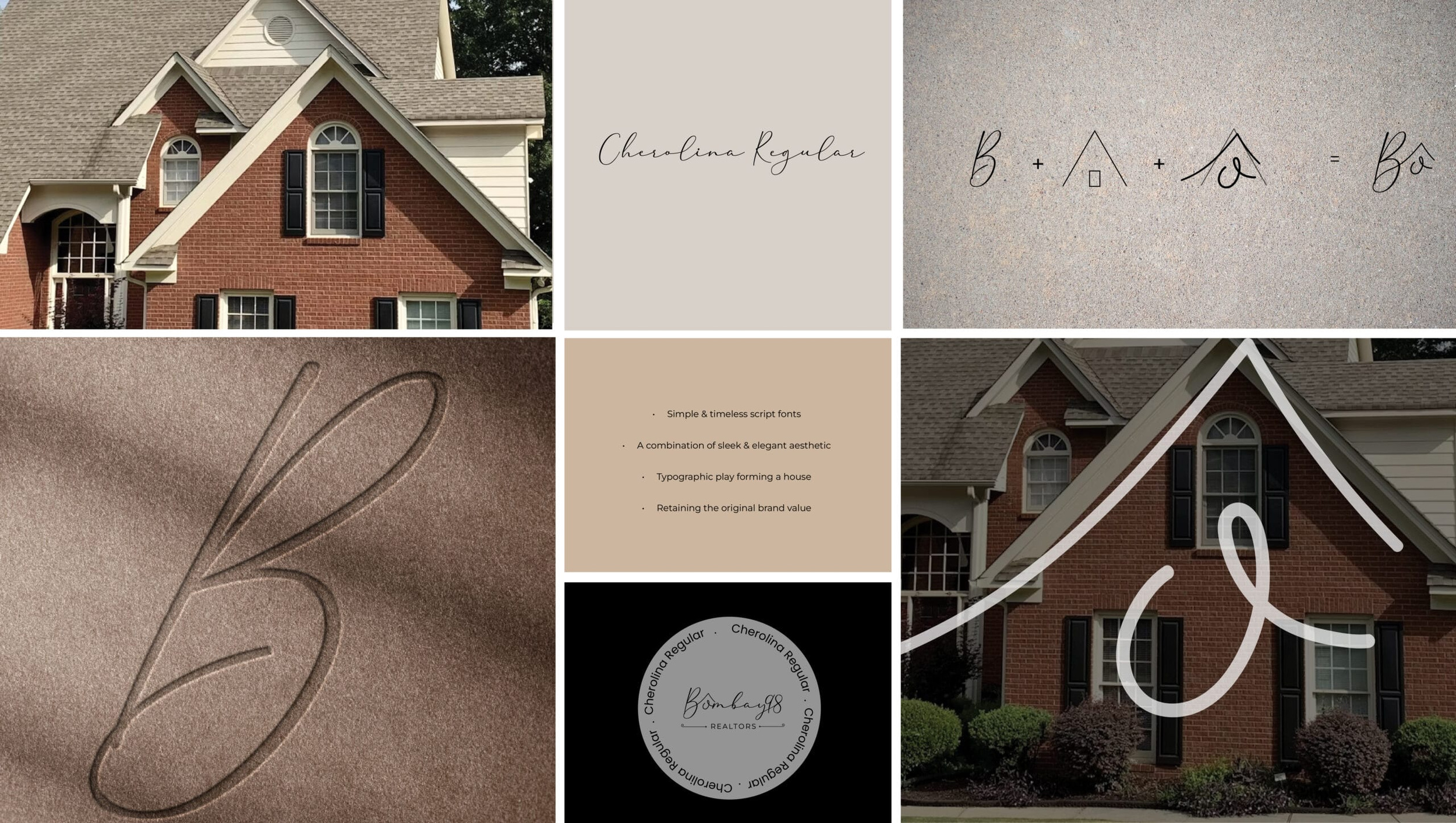
The identity brings together two contrasting ideas. A fluid script gives the name warmth and personality, while a geometric symbol derived from the structure of a house provides a sense of stability. Its upward-facing form introduces a subtle expression of progress and prosperity, allowing familiar architectural cues to take on a more distinctive character.
Together, the elements create an identity that feels established without becoming conventional. Confident enough for a sophisticated real estate audience, but expressive enough to be remembered.
After all, in real estate, standing out is usually a good property to have.