
Ad- tours and travels
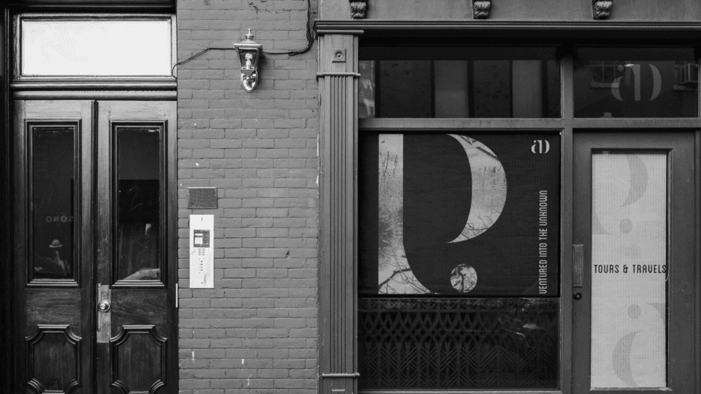
AD Tours & Travels Type: Luxury Travel Agency Objective: Rebranding and Visual Identity Refresh Target Audience: Travelers seeking premium and bespoke travel experiences Challenges Faced Market Positioning: Despite their long standing reputation, AD Tours needed a refreshed brand image to appeal to modern travelers while maintaining their legacy of excellence. Visual Identity: The goal was to create a sophisticated yet contemporary look that symbolizes their top-tier hospitality and exclusive experiences. Standing Out in a Competitive Market: With a crowded travel market, AD Tours needed a distinctive brand language that resonated with luxury travelers and communicated their premium service offering. Meraki’s Solution Branding: We developed a typography-driven brand language that is sleek, contemporary, and luxurious, aligning perfectly with the upscale nature of AD Tours’ travel experiences. Logo and Collateral Design: A refined new logo was created, accompanied by visually cohesive branding materials that embody the elegance and exclusivity AD Tours offers. Animation: A fun and engaging animation was incorporated to add a modern, dynamic touch to the brand, capturing the joy and excitement of travel. Impact Refreshed Brand Image: The rebranding successfully transformed AD Tours & Travels into a modern, premium travel brand while staying true to their rich legacy. Enhanced Market Positioning: The sleek and contemporary design appealed to a new generation of travelers, while still maintaining loyalty from their established clientele. Increased Recognition: The refined typography and luxurious visual identity helped AD Tours stand out in a highly competitive market, further solidifying their position as leaders in bespoke travel experiences.
Airbuzz Training
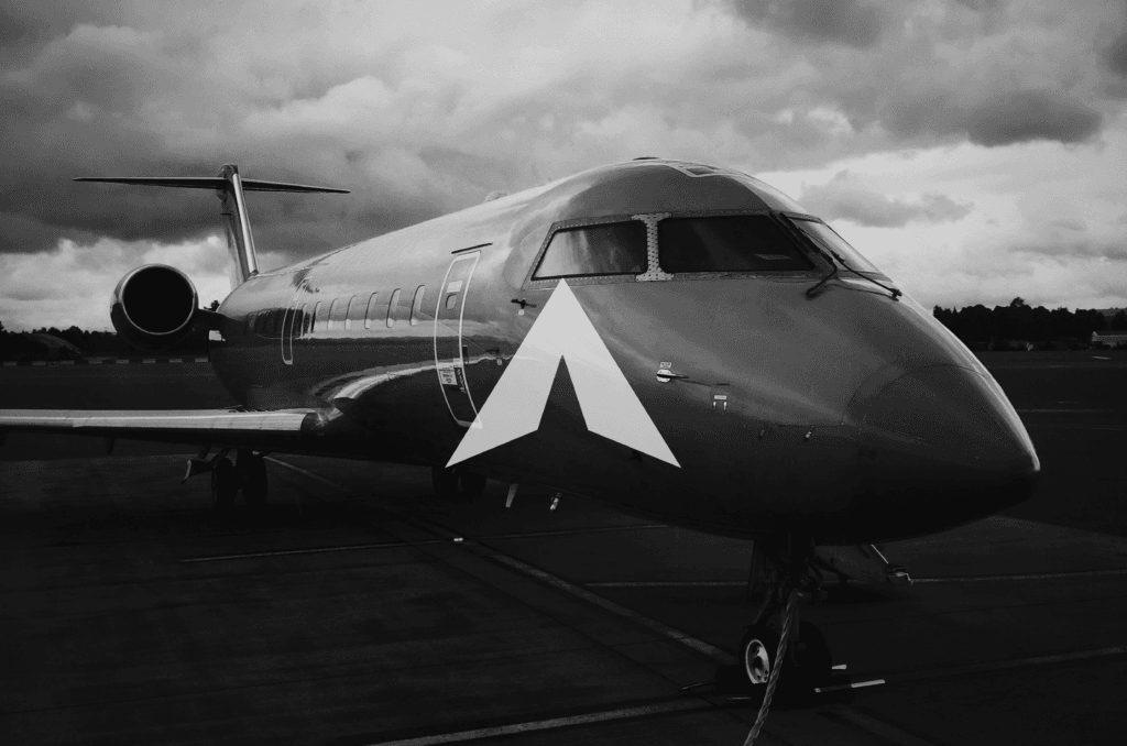
Airbuzz Pilot Training Academy Type: Aviation Training Institute Objective: Complete Rebranding, Brand Identity, Collaterals, and Social Media Strategy Target Audience: Aspiring pilots and aviation professionals seeking a credible, premium, and modern pilot training institute in India. Read more Challenges Faced Brand Perception: Refreshing the brand to reflect the professionalism, precision, and aspiration associated with aviation, while moving away from a dated or generic training‑institute look. Differentiation: Standing out in a competitive pilot training space by creating a distinct, premium identity that inspires confidence among students and parents alike. Consistency Across Touchpoints: Ensuring the new brand language translated seamlessly across physical collaterals and digital platforms. Meraki’s Solution Complete Rebranding: Developed a sleek, minimal, and premium visual identity aligned with the world of aviation, focusing on clarity, confidence, and aspiration. Brand Identity & Collaterals: Designed a comprehensive suite of brand assets including visiting cards, brochures, apparel, and on‑ground materials, ensuring a cohesive and polished presence across all touchpoints. Social Media Strategy & Content Creation: Crafted a clear social media strategy and ongoing content ecosystem covering copywriting, visual design, video shoots, and editing, positioning Airbuzz as aspirational yet approachable for future pilots. Impact Elevated Brand Perception : Airbuzz now presents itself as a premium, professional pilot training academy aligned with international aviation standards. Visual Consistency & Recall: Created a cohesive brand experience across offline and online platforms, improving recognition and credibility. Enhanced Digital Presence: Built a strong content foundation for social media that communicates professionalism, ambition, and trust, supporting long‑term brand growth and student engagement. https://merakidesign.in/wp-content/uploads/2026/02/Slide-2.mp4https://merakidesign.in/wp-content/uploads/2026/01/Slide-3-1.mp4 https://merakidesign.in/wp-content/uploads/2026/01/Slide-4-1-1.mp4
Mantri Realtors
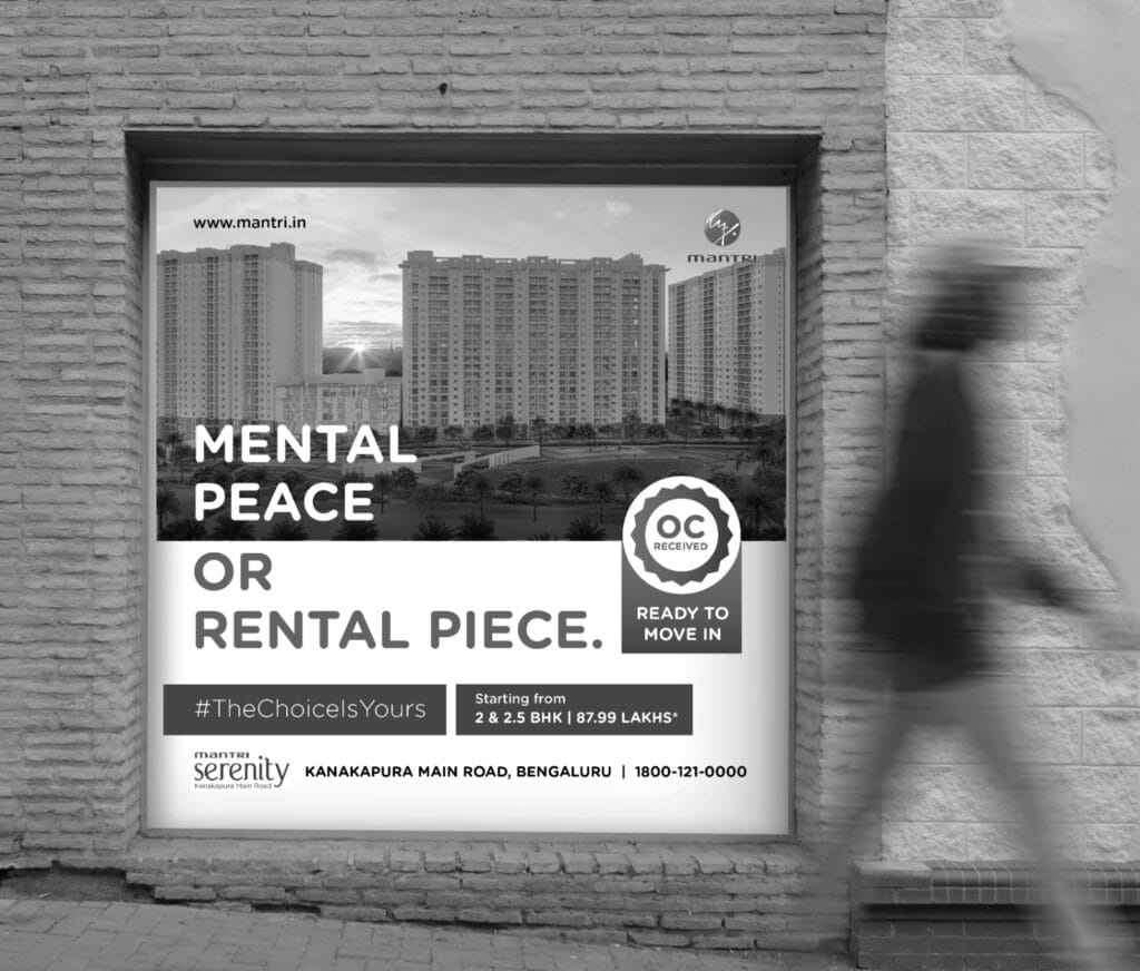
Mantri Realtors Type: Real Estate Development Company Objective: Digital and Outdoor Advertising Campaign Target Audience: IT professionals in North Bangalore Mantri Developers, an innovation-led company at the forefront of transforming South India’s skyline, aimed to promote their Mantri Webcity development through a strategic advertising campaign. Challenges Faced Market Awareness: Creating awareness about Mantri Webcity among IT professionals in a competitive real estate market. Shifting Perceptions: Encouraging potential buyers to transition from renting to homeownership by emphasizing affordability and benefits. Meraki’s Solution Campaign Development: Executed the #TheChoiceIsYours campaign, focusing on the unique value proposition of Mantri Webcity for North Bangalore’s IT community. Advertising Strategy: Utilized a mix of digital and outdoor advertising to reach the target audience effectively, showcasing affordable EMI plans that make homeownership attainable in India’s Silicon Valley. Meraki’s Solution Campaign Development: Executed the #TheChoiceIsYours campaign, focusing on the unique value proposition of Mantri Webcity for North Bangalore’s IT community. Advertising Strategy: Utilized a mix of digital and outdoor advertising to reach the target audience effectively, showcasing affordable EMI plans that make homeownership attainable in India’s Silicon Valley. Impact The campaign successfully positioned Mantri Webcity as an attractive option for IT professionals, driving interest in homeownership and contributing to a 20% increase sales engagement with the brand, ultimately helping many make the dream of owning a home a reality. https://merakidesign.in/wp-content/uploads/2024/01/mg.mp4
Baes Leaf
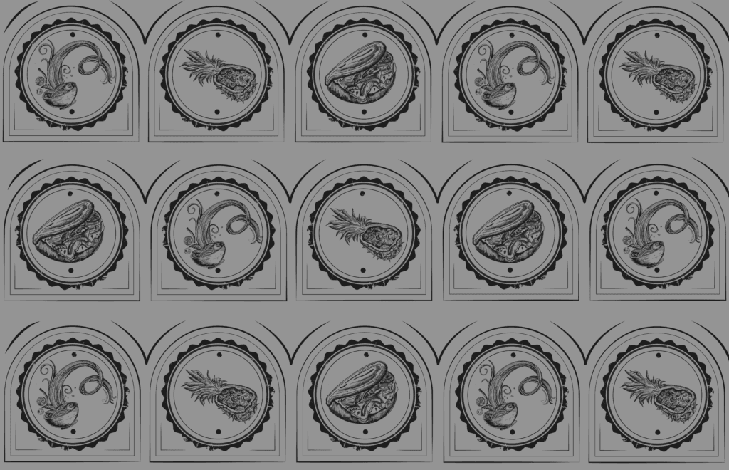
Baes Leaf Type: Cloud kitchen specializing in Thai veg fusion cuisine Objective: Menu card design Target Audience: Food enthusiasts seeking innovative and flavorful plant-based Thai fusion dishes Read more Challenges Faced Visual Appeal: Creating a design that is both visually engaging and reflective of the deliciousness of the food. Brand Consistency: Ensuring that the menu design aligns with Baes Leaf’s brand values of minimalism and sophistication while showcasing the richness of the cuisine. Meraki’s Solution Design Aesthetic: Crafted an intricate, minimalistic design with hand-drawn illustrations of Baes Leaf’s signature dishes, ensuring every dish is represented authentically. Colour Palette: Employed a refined cream and olive colour scheme to maintain a clean, modern look while enhancing the food’s visual appeal. Craftsmanship: Focused on subtle details that highlight the intricacy of the dishes, making the menu itself a part of the dining experience. Impact Elevated Brand Image: The menu’s sophisticated design helped position Baes Leaf as a premium brand in the competitive food delivery market. Enhanced Customer Experience: The artistic, yet functional design of the menu adds a layer of excitement and anticipation for customers, complementing their dining experience. Increased Brand Recognition: The menu’s unique visual identity serves as a strong branding tool, creating a lasting impression with every order. https://merakidesign.in/wp-content/uploads/2024/12/Baesleaft-desktop-1.mp4
Formosa Floors

Formosa Floors Type: Premium SPC Flooring Brand Objective: Build a distinct identity and establish brand presence in a competitive flooring market through comprehensive branding, digital presence, and a robust marketing strategy Target Audience: Homeowners, interior designers, architects, and real estate developers Challenges Faced New Brand, Zero Awareness:Formosa was entering a saturated market with no prior digital or offline presence. Lack of Brand Identity:There was no logo, tone of voice, or visual guide— a complete brand build was required.Premium Offering, Low Familiarity:While SPC flooring is high-quality, the general audience was unfamiliar with its features and benefits. Highly Visual Industry:The brand needed to establish trust and aspiration in a segment driven by aesthetics and functionality. Meraki’s Solution End-to-End Branding:Developed a strong and luxe brand identity with a modern logo, refined typography, and a sophisticated visual palette to reflect Formosa’s premium positioning. Website Design & Development:Created a sleek, intuitive website that not only showcased products beautifully but also educated users about SPC flooring and its advantages. Social Media Launch & Strategy:Built their social media presence from scratch — with content pillars focused on product education, design inspiration, behind-the-scenes processes, and installation highlights. Visual Language:Focused on warm, homely visuals paired with clean, editorial design to appeal to both homeowners and professionals in the interiors space. Content Marketing:Developed engaging content formats including transformation posts, expert tips, and moodboard-style layouts to build aspiration and awareness. Impact Formosa Floors successfully transitioned from a new entrant to a recognizable name within the interiors community. The brand saw steady growth in engagement, inquiries, and collaborations — with a growing audience of design professionals and homeowners actively exploring their offerings. The cohesive visual identity and strategic online presence positioned Formosa as a premium, trustworthy choice in the SPC flooring category. https://merakidesign.in/wp-content/uploads/2023/11/Formosa-Logo-animation-v4.mp4https://merakidesign.in/wp-content/uploads/2023/11/v.mp4 https://merakidesign.in/wp-content/uploads/2023/11/posts.mp4https://merakidesign.in/wp-content/uploads/2023/11/Formosa-Book-Video-1.mp4
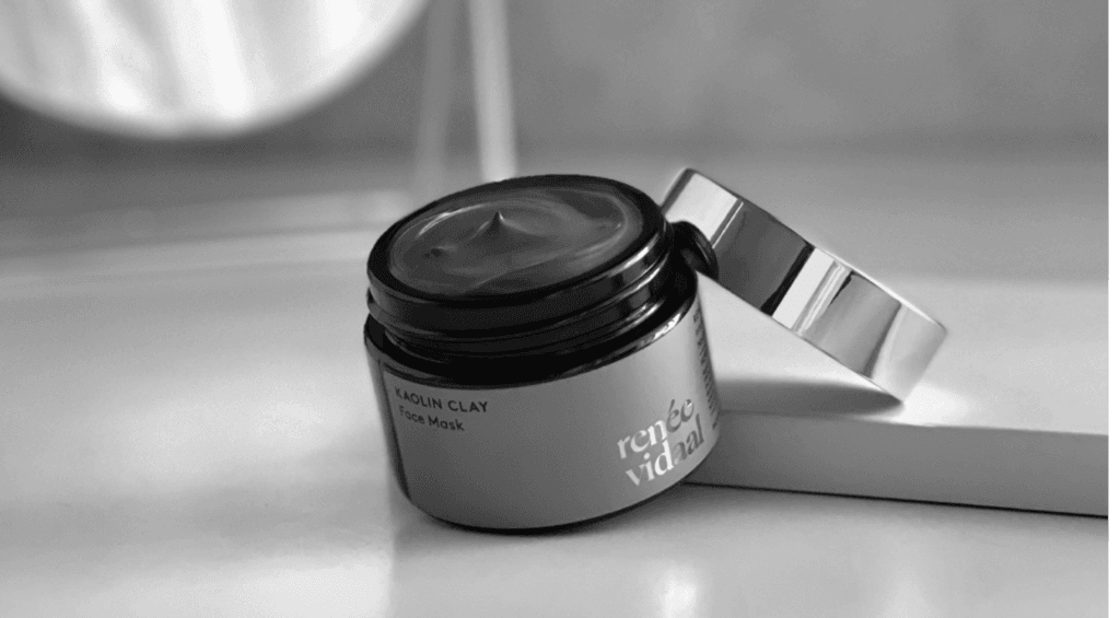
Renee Vidaal
The quirky and fascinating logo designing, branding and labelling of Tangy Tongue, a delectable Schezwan dip.
Bombay98

Bombay 98 & RCR Realtors Type: Real Estate Brand Identity Design Objective: Creating distinct visual identities for both Bombay 98 and RCR Realtors Target Audience: Real estate buyers, investors, and property developers Bombay 98 and RCR Realtors, a renowned real estate duo, entrusted us with creating impactful brand identities that resonate with their audience and elevate their market presence. Challenges Faced Establishing Credibility: Ensuring the brand identities conveyed trust and reliability, critical for success in the competitive real estate market. Appealing to Target Markets: Designing logos that align with the brands’ individual ethos while appealing to a sophisticated real estate clientele. Meraki’s Solution Bombay 98: For Bombay 98, we incorporated a flowy script font with typographic play that emphasizes credibility and trust. The design focused on boosting the brand’s market perception. The graphic element of the logo is derived from the structure of a house, which is facing upwards to symbolize success and prosperity. RCR Realtors: For RCR Realtors, we crafted a classic typographic monogram combined with a circular emblem that pays homage to Feng Shui principles. The intertwined initials symbolize the brand’s years of experience, forming a cohesive and recognizable identity. Impact Both brand identities successfully communicated trust, experience, and market expertise. The distinctive visual direction helped Bombay 98 and RCR Realtors strengthen their individual market positions while also creating a cohesive unit that resonated with their audience.
Plum Goodness
The quirky and fascinating logo designing, branding and labelling of Tangy Tongue, a delectable Schezwan dip.
L’Amour
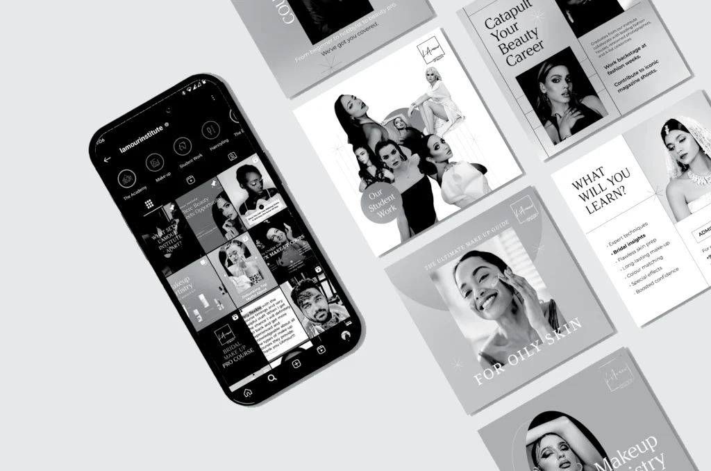
L’Amour Type: Beauty Training Institute in Dubai Objective: Refresh and elevate the brand’s digital presence to reflect its premium positioning and attract aspiring beauty professionals Target Audience: Aspiring make-up artists, hairstylists, nail technicians, and beauty enthusiasts across the UAE and beyond Challenges Faced Outdated Digital Presence:The existing online identity didn’t reflect the institute’s expertise or industry relevance. Lack of Cohesion:Visual elements, tone, and messaging varied across platforms, weakening the brand’s impact. Underrepresented Offerings:Courses and student achievements weren’t being showcased effectively, leading to missed opportunities for engagement and trust-building. Competitive Industry:Dubai’s beauty education space is crowded — L’Amour Institute needed to stand out with clarity and confidence. Meraki’s Solution Digital Identity Refresh:Redesigned the brand’s digital touchpoints with a luxe, modern aesthetic. Clean layouts, refined typography, and gradient blends reflected the textures of make-up artistry. Content Strategy & Execution:Built a cohesive content mix covering:– Course promotions that conveyed value– Student testimonials for credibility– Expert-backed tips & tricks for engagement– Behind-the-scenes moments and real student work to build authenticity Platform Consistency:Streamlined the look and feel across platforms, ensuring every post felt unmistakably L’Amour — polished, aspirational, and informative.Visual Language for Beauty Education:Created a unique style that balanced professional credibility with creative flair, appealing to young learners and working professionals alike. Impact The refreshed digital presence positioned L’Amour Institute as a go-to destination for beauty education in the region. The brand began drawing in more engagement from both students and mentors, fostering a growing online community of beauty professionals. The clean, compelling, and consistent content approach strengthened their authority, enhanced brand trust, and built lasting recall in a competitive market. https://merakidesign.in/wp-content/uploads/2025/02/1739524437467554.mp4 https://merakidesign.in/wp-content/uploads/2025/02/Make-Up-Artistry-Pro-Plus-VO.mp4https://merakidesign.in/wp-content/uploads/2025/02/LAmour-X-Bouba.mp4https://merakidesign.in/wp-content/uploads/2025/02/LAmour-Student-Work.mp4https://merakidesign.in/wp-content/uploads/2025/02/Make-Up-Artistry-Pro-Plus-VO.mp4 https://merakidesign.in/wp-content/uploads/2025/02/LAmour-Student-Work.mp4