Ecole Intuit Lab
Ecole Intuit Lab Type: French School of Design Objective: Develop a 360° marketing and branding strategy to boost global presence and attract top design talent Target Audience: Design students, industry professionals, and global educational institutions Challenges Faced Outdated Brand Image: Needed a refresh to attract a modern, younger audience Market Saturation: Differentiation in a crowded design education space Inconsistent Branding: Required a unified message across all platforms Low Global Visibility: Needed to boost international recognition and reputation Meraki’s Solution Brand Modernization: Fresh visuals, cohesive color palette, and simplified tone for youth appeal Multi-Channel Marketing: Integrated social media, email, video content, podcasts, and trends for engagement Influencer Collaborations: Partnerships with industry leaders to increase credibility Performance Marketing: Targeted ads to drive lead generation and enrollment Global Positioning: Strategic branding to establish Ecole Intuit Lab as a global leader in design education. Impact 200% increase in admission rate, significantly boosting student enrollment. 300% surge in engagement rate, elevating the brand’s visibility and interaction across digital platforms. https://merakidesign.in/wp-content/uploads/2023/10/Untitled-1.mp4https://merakidesign.in/wp-content/uploads/2023/10/Untitled-2.mp4 https://merakidesign.in/wp-content/uploads/2023/10/Untitled-3-1.mp4https://merakidesign.in/wp-content/uploads/2023/10/ecole.mp4
Gymtonico
Gymtonico Type: Fitness & Lifestyle Brand Objective: Brand Identity, Website Development, Content Strategy, and Collaterals Target Audience: Urban fitness enthusiasts, lifestyle-driven individuals, and community-focused members seeking a sustainable and science-backed approach to fitness. Read more Challenges Faced Differentiating in a saturated market: The fitness industry is crowded with performance-driven, transformation-heavy brands. Gymtonico needed to stand apart with a more lifestyle-led, sustainable positioning. Building a strong brand personality: The brand needed a distinct voice that felt bold, modern, and relatable, while avoiding typical “aggressive fitness” communication. Creating a cohesive identity across touchpoints: From in-gym experiences to digital platforms, the brand required a unified visual and verbal system that could scale consistently. Meraki’s Solution Brand Identity & Logo Design: Developed a distinctive and minimal logo system using geometric elements (circle and line forms) with precise ratios and structure to ensure scalability and recall. Visual Identity System: Built a comprehensive design language including color palette, typography, patterns, iconography, and photography direction to create a bold, modern, and fluid brand aesthetic. Verbal Identity & Tone of Voice: Defined a sharp, motivational, and relatable tone using short, impactful phrases like “Break The Flow,” ensuring all communication feels concise, confident, and relatable. Website & Content Development: Crafted website messaging focused on lifestyle, community, and long-term fitness rather than quick transformations. Positioned Gymtonico as an experience, not just a gym. Collaterals & Brand Applications: Designed business cards, merchandise, in-gym communication, and marketing assets aligned with the core identity system for consistent offline and online presence. Social Media & Digital System: Created adaptable social media templates and a visual system emphasizing motion, energy, and realism to maintain consistency across platforms. Impact Strong & Differentiated Brand Positioning: Gymtonico stands out as a lifestyle-first fitness brand, moving away from conventional transformation-driven narratives. Consistent & Scalable Brand System: A unified visual and verbal identity ensures seamless communication across digital, physical, and experiential touchpoints. Enhanced Community Appeal: The tone, messaging, and brand philosophy resonate deeply with users seeking a more balanced, sustainable fitness journey. Elevated Brand Recall: Distinctive design elements, bold messaging, and a cohesive ecosystem create a memorable and modern brand presence. https://merakidesign.in/wp-content/uploads/2026/04/black-one.mp4 https://merakidesign.in/wp-content/uploads/2026/04/Sequence-0521212.mp4https://merakidesign.in/wp-content/uploads/2026/04/Frame-6-2.mp4https://merakidesign.in/wp-content/uploads/2026/04/Frame-6-1.mp4 https://merakidesign.in/wp-content/uploads/2026/04/MIND-BODY.mp4https://merakidesign.in/wp-content/uploads/2026/04/Frame-134.mp4 https://merakidesign.in/wp-content/uploads/2026/04/Frame-117-2.mp4 https://merakidesign.in/wp-content/uploads/2026/04/Video.mp4https://merakidesign.in/wp-content/uploads/2026/04/Hello-1.mp4https://merakidesign.in/wp-content/uploads/2026/04/Animated-iPhone-mockups-1.mp4 https://merakidesign.in/wp-content/uploads/2026/04/Frame-7.mp4
Tickle-Right
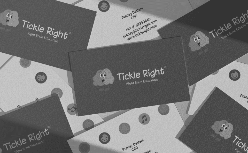
Tickle Right Type: Early childhood education program for holistic brain development Objective: Branding and Positioning Target Audience: Parents seeking innovative educational solutions for young children Challenges Faced Parental Awareness: Explaining the unique value of right-brain development to parents unfamiliar with its benefits. Building Trust: Gaining credibility in a niche educational field by proving the program’s effectiveness. Market Differentiation: Standing out in a crowded market of academic and extracurricular programs. Learning Flexibility: Addressing diverse learning styles and developmental stages. Scalable Marketing: Expanding reach while maintaining consistent messaging across regions. Meraki’s Solution Parent Education: Created engaging content (videos, infographics, testimonials) to clearly communicate the benefits of right-brain development. Trust Building: Highlighted success stories, expert endorsements, and real parent testimonials to enhance credibility. Distinct Branding: Developed a unique visual identity and messaging that emphasized Tickle Right’s holistic and personalized approach. Flexibility: Designed adaptable program content and marketing materials to cater to varying developmental stages and learning preferences. Scalable Marketing: Implemented a multi-channel marketing strategy with digital ads, social media, and local outreach, ensuring consistent, regionally tailored messaging. Impact Engagement rate has increased over 900%. Admission rates have grown by a minimum of 275% percent year on year. Over 4000 leads per month are being generated through performance marketing only. 94 percent of admissions are being driven organically through content marketing and trust building marketing activities. 21 franchisees have been closed since Meraki has been onboarded. https://merakidesign.in/wp-content/uploads/2023/11/1734332784738546.mp4https://merakidesign.in/wp-content/uploads/2023/11/1733724418945260.mp4 https://merakidesign.in/wp-content/uploads/2025/04/tr-updated-timeline.mp4
Flourish Planet
Flourish Planet Type: Direct-to-community e-commerce platform highlighting the stories, craftsmanship, and sustainable impact of global artisans Objective: Branding and Packaging Design Target Audience: Socially conscious consumers seeking ethically sourced, handcrafted products Read more Challenges Faced Core Values: Communicating inclusivity, sustainability, and transparency in a convenience-driven market. Niche Targeting: Reaching eco-conscious consumers while expanding the audience. Global Consistency: Maintaining brand identity across diverse markets. Greenwashing Skepticism: Proving authenticity amid competing sustainability claims. Emotional Connection: Building emotional bonds through artisan stories. Meraki’s Solution Branding: Created an eco-friendly visual identity reflecting Flourish Planet’s values. Campaigns: Highlighted social and environmental impact to encourage mindful purchasing. Consistency: Developed a global brand guide for consistent messaging with local adaptation. Authenticity: Used transparent design elements like sourcing details and artisan stories. Storytelling: Leveraged artisan profiles to foster emotional connections. Impact Increased Brand Reach: Refreshed identity and storytelling expanded Flourish Planet’s appeal to eco-conscious consumers globally. Enhanced Customer Loyalty: Emotional connections, driven by artisan stories and social impact, boosted repeat purchases. Higher Sales: Achieved a sharp rise in conversions and sales within a quarter through targeted marketing and stronger engagement. https://merakidesign.in/wp-content/uploads/2024/10/WhatsApp-Video-2024-10-04-at-12.01.21-PM.mp4 In handcrafted gems, artisans dream and mastery reside.
Dhruvathara
Dhruvathara Type: Global Investment & Enterprise Ecosystem Objective: Brand Identity Creation, Visual Language System, Logo & Symbol Design, and Foundational Brand Narrative Target Audience: Global investors, business leaders, policymakers, and enterprises across the Indian Ocean Rim seeking long-term, ethical, and high-value growth partnerships. Read more Challenges Faced Abstract & Multi-Sector Positioning: Dhruvathara operates across multiple industries including hospitality, real estate, finance, healthcare, and more, making it challenging to define a clear, singular identity without diluting its breadth. Balancing Authority with Approachability: As an enterprise rooted in ethics, stewardship, and long-term value creation, the brand needed to feel credible and authoritative while maintaining a calm, refined presence. Creating a Distinct Global Identity: The brand required a visual and verbal system that could resonate across geographies while staying rooted in its core philosophy of balance, transformation, and sustainability. Meraki’s Solution Brand Identity & Narrative Development: Crafted a strong foundational narrative positioning Dhruvathara as a future-focused, ethically driven investment ecosystem shaping enduring value. Logo & Symbol Design: Designed a distinctive symbol representing balance and transformation, where precision meets fluidity, embodying the brand’s role as a quiet yet powerful force guiding businesses forward. Visual Language System: Built a cohesive visual ecosystem including color palette, typography, and geometric patterns that reflect stability, sophistication, and global relevance. Verbal Identity & Tone of Voice: Defined a communication framework that is confident, ethical, and future-oriented, speaking the language of global decision-makers with clarity and restraint. Impact Strong, Future-Ready Brand Foundation: Dhruvathara now has a clearly defined identity that communicates its vision, values, and multi-sector presence with precision. Elevated Global Perception: A refined and sophisticated visual and verbal language positions the brand as credible, authoritative, and internationally relevant. Unified Brand System: Every touchpoint, from logo to communication, now reflects a consistent philosophy of stewardship, resilience, and value creation. Distinct & Memorable Identity: The symbol, visual patterns, and structured language together create a powerful and recognizable brand presence. https://merakidesign.in/wp-content/uploads/2026/04/1.mp4 https://merakidesign.in/wp-content/uploads/2026/04/4.mp4 https://merakidesign.in/wp-content/uploads/2026/04/22.mp4 https://merakidesign.in/wp-content/uploads/2026/04/3-1.mp4
Fundly

Fundly Type: Fintech & Digital Ecosystem for the Pharmaceutical Industry Objective: Brand Evolution, Website Enhancement, Visual Identity System, Collaterals, Mascot Creation, and Full-Funnel Social Media Strategy Target Audience : Pharmaceutical retailers, distributors, manufacturers, and industry stakeholders. Read more Challenges Faced Complex Offering, Single Brand: Fundly operates across three strong pillars: Credit, Commerce, and Payments, which needed to be communicated clearly without overwhelming users. Trust & Credibility: As a fintech platform in a highly regulated and trust-driven industry, Fundly needed to establish credibility while still feeling approachable. Visual & Messaging Consistency:Ensuring that the website, app, social media, founder’s LinkedIn presence, and collaterals all spoke the same language. Meraki’s Solution Brand & Website Refinement: Enhanced Fundly’s website to feel cleaner, sharper, and more intuitive. Visual Identity & Brand Assets: Built a cohesive visual ecosystem including brand collaterals, digital assets, and a distinctive mascot to humanize the platform & improve recall. Social Media Strategy & Content Ecosystem: Designed and executed a comprehensive social media strategy spanning content planning, copywriting, design, shoots, and editing. Founder & Leadership Branding: Strengthened the founder’s LinkedIn presence with thought-led content. Impact Clear, Cohesive Brand Narrative: Fundly now communicates its Credit, Commerce, and Payments offerings under one unified, easy-to-understand brand story. Elevated Brand Credibility: A refined visual language and consistent messaging helped boost credibility. Stronger Digital Presence & Awareness: Created a scalable content foundation across platforms, supporting app downloads, engagement, and long-term growth. Distinct Brand Recall: The mascot, collaterals, and visual system together gave Fundly a distinctive, modern identity. https://merakidesign.in/wp-content/uploads/2026/02/Video.mp4 https://merakidesign.in/wp-content/uploads/2026/02/onboarding-steps-video.mp4 https://merakidesign.in/wp-content/uploads/2026/02/Sequence-02-1.mp4 https://merakidesign.in/wp-content/uploads/2026/02/Size-3.mp4
Biofrost
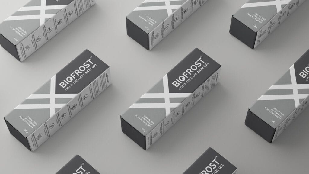
Biofrost Type: Natural pain relief gel powered by Cryotherapy Objective: Branding and Packaging Design Target Audience: Sports Enthusiasts and Athletes Read more Challenges Faced Market Positioning: Building awareness and trust in a new market segment in India. Product Perception: Positioning Biofrost as a revolutionary pain therapy product, not medicinal. Packaging: Standing out among sports-related products on crowded shelves. Meraki’s Solution Branding: Developed a complete brand experience, from logo to guidelines, reflecting Biofrost’s innovation. Packaging: Designed bold, bright geometric packaging to attract athletes and differentiate from competitors. Visual Impact: Communicated cryotherapy’s innovation and effectiveness with attention-grabbing design. Impact Product sales increased by 20% in the competitive sports industry, driven by strategic branding and marketing efforts. Successfully repositioned Biofrost from a medicinal pain relief gel to a premium cryotherapy solution for athletes. Strategic marketing campaigns and bold packaging elevated Biofrost’s presence, driving both awareness and demand within the sports community. CONCEPT With a designer’s eye for detail, the bold and sporty geometric pattern consisting of lines was unmissable. It is a design element used across various sports such as tennis, football, rugby, cricket, and volleyball. Inspired by the design’s fun and sporty vibe, we have curated a graphic element for our product. Brand Evolution New Visual Element Brand Evolution New Visual Element Brand Evolution New Visual Element Brand Evolution New Visual Element
Trackblazers Sports Academy
Trackblazers Sports Academy Type: Athletics training academy for children and adults Objective: Branding and Positioning Target Audience: Parents of young athletes, school-going children, fitness-focused adults, and competitive runners Read more Challenges Faced Awareness: Creating visibility for structured athletics training among parents and adults seeking long-term sporting development for their children or themselves. Brand Identity:Crafting a distinct, professional image that reflects Trackblazers’ competitive edge while remaining welcoming to beginners. Outdated Visual Identity: While the brand had cohesion, the previous logo and visual elements felt dated and didn’t reflect the academy’s evolving professionalism or athletic ambition, limiting perception and recognition. Digital Engagement: The brand lacked a strong online presence to connect with modern, mobile-first audiences who actively research programs via social media and search. Meraki’s Solution Complete Rebrand:Developed a refreshed identity system, including logo, color palette, typography, collaterals, and stationery. The logo is clean, modern, and inspired by the curvature of a stadium track, capturing the essence of movement, discipline, and forward momentum. Website Development: Designed a performance-oriented website to showcase programs, coaching credibility, athlete testimonials, training schedules, and a seamless lead generation flow. Social Media Strategy: Created a unified brand voice across platforms, featuring training highlights, athlete journeys, behind-the-scenes visuals, and educational content about athletics as a sport. Engagement-Led Content: Built storytelling frameworks that connected with both parents and athletes, focusing on discipline, transformation, and the confidence that sport cultivates. Impact A clearly differentiated brand identity that reflects professionalism, credibility, and athletic spirit Stronger digital presence, with improved storytelling and engagement across social channels Streamlined communication across physical and digital mediums, boosting trust among prospects Better alignment between coaching philosophy, brand perception, and parent expectations A brand foundation built to support long-term growth, expansion, and community-building https://merakidesign.in/wp-content/uploads/2025/08/header-animation.mp4 https://merakidesign.in/wp-content/uploads/2025/08/tsa-logo-1.mp4 Let’s transform India https://merakidesign.in/wp-content/uploads/2025/08/rotating-text.mp4 into an athletic nation. https://merakidesign.in/wp-content/uploads/2025/08/flash-image-1.mp4 https://merakidesign.in/wp-content/uploads/2025/08/woman-running-poster.mp4https://merakidesign.in/wp-content/uploads/2025/08/cap.mp4https://merakidesign.in/wp-content/uploads/2025/08/bottle.mp4https://merakidesign.in/wp-content/uploads/2025/08/jersey.mp4
Fruitscout
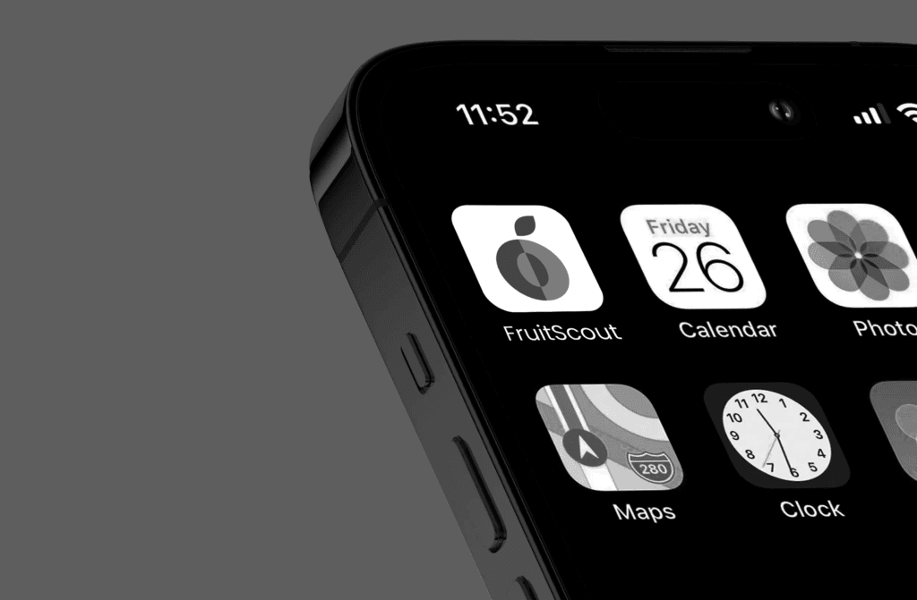
Fruitscout Type: Agricultural AI Platform for Yield Forecasting Objective: Branding and Positioning Target Audience: Commercial fruit growers seeking data-driven accuracy in field monitoring and yield predictions Read more Challenges Faced Technical Translation: Explaining AI-powered yield prediction to growers in a way that’s practical, grounded, and actionable. Dual Identity: Balancing FruitScout’s tech-first foundation with the grounded, organic world of agriculture. Forecast Skepticism: Overcoming decades of unreliable, gut-based yield estimates by earning trust through AI-driven insights. Crop Diversity: Creating a brand system that works for multiple crops and geographies, from apples in Washington to agave in Mexico. Brand Recall: Designing a distinctive, scalable visual identity that could carry across pitch decks, field reports, investor meetings, and in-app UI. Meraki’s Solution Complete Branding Suite: Created FruitScout’s visual identity, including logo, color palette, typography, collaterals, and stationery. The logo seamlessly merges the sharp geometry of a camera aperture with the organic silhouette of a growing plant, symbolizing precision meeting growth: a perfect reflection of FruitScout’s purpose. Positioning Framework: Positioned FruitScout around five key pillars: Precision, Innovation, Clarity, Scalability, & Trust. Brand Story & Messaging: Developed a clear, consistent brand voice rooted in confidence without complexity, giving growers the “clarity to act” rather than tech jargon to decode. Impact Strong Visual Identity that communicates FruitScout’s blend of cutting-edge AI and agricultural grounding. Increased Market Adoption with growers trusting AI-generated predictions through simplified, non-technical communication. Cross-Crop Scalability thanks to adaptable branding that travels seamlessly from apple orchards to agave fields. https://merakidesign.in/wp-content/uploads/2025/07/text.mp4https://merakidesign.in/wp-content/uploads/2025/07/text-portrait.mp4 Making The Unmeasurable Measurable Born from engineering excellence, FruitScout applies cutting-edge AI and computer vision to revolutionize field production monitoring. https://merakidesign.in/wp-content/uploads/2025/07/logo-animation.mp4 Accuracy to Your Crop Load Management https://merakidesign.in/wp-content/uploads/2025/07/rotating-text.mp4 https://merakidesign.in/wp-content/uploads/2025/07/carousel-1.mp4
Enwrapt
EnWrapt Type: Mindful gifting brand powered by science and personalization Objective: Branding and Positioning Target Audience: Corporates, individuals seeking sustainable yet premium gifting solutions, and anyone looking for intentional, personalized gifting experiences Challenges Faced Awareness: The concept of science-led, personalized gifting was relatively new. The brand needed to educate its audience while also creating desire and trust around a curated gifting experience. Perception of Gifting:Gifting is often seen as transactional. EnWrapt wanted to reframe it as transformational – a conscious act of connection, emotion, and sustainability. Digital Presence: With an audience that actively discovers and purchases online, the brand needed a distinctive digital-first identity to create recall and engagement. Scalability: The identity system needed flexibility to expand into new product ranges, partnerships, and digital tools, without diluting its core philosophy of mindful gifting. Meraki’s Solution Complete Brand Identity: We crafted a refreshed identity system encompassing logo, typography, color palette, and visual elements, designed to balance luxury with warmth, and structure with flow. Logo & Symbolism: The EnWrapt logo blends timeless elegance with meaning. The curved “e–n” monogram depicts a ribbon, symbolizing both the act of wrapping and the bond between giver and recipient. This balance of structure and warmth perfectly mirrors the brand’s essence: personal, intentional, and emotionally resonant. Visual Language: We extended the identity with organic curves derived from the “e–n” form in the logo. This fluid shape runs across digital and print applications, echoing themes of flow, continuity, and connection. It brings movement and harmony to the brand system, ensuring consistency and recognizability. Impact A premium yet approachable brand identity that communicates mindfulness, sophistication, and emotional depth. Stronger visual recall through the elegant logo and signature typography. Seamless alignment between brand philosophy (intentional gifting) and customer perception. A scalable identity system adaptable for product ranges, collaborations, and digital-first experiences. Differentiated positioning in the gifting market by combining science, sustainability, and storytelling. We crafted the complete brand identity for EnWrapt: A mindful gifting brand where every gift is designed for intention, emotion, and lasting impact.https://merakidesign.in/wp-content/uploads/2025/08/images.mp4https://merakidesign.in/wp-content/uploads/2025/08/WhatsApp-Video-2025-08-26-at-11.17.11-AM.mp4https://merakidesign.in/wp-content/uploads/2025/08/5.mp4 https://merakidesign.in/wp-content/uploads/2025/08/text-animation.mp4