Gymtonico
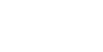
Gymtonico Type: Fitness & Lifestyle Brand Objective: Brand Identity, Website Development, Content Strategy, and Collaterals Target Audience: Urban fitness enthusiasts, lifestyle-driven individuals, and community-focused members seeking a sustainable and science-backed approach to fitness. Read more Challenges Faced Differentiating in a saturated market: The fitness industry is crowded with performance-driven, transformation-heavy brands. Gymtonico needed to stand apart with a more lifestyle-led, sustainable positioning. Building a strong brand personality: The brand needed a distinct voice that felt bold, modern, and relatable, while avoiding typical “aggressive fitness” communication. Creating a cohesive identity across touchpoints: From in-gym experiences to digital platforms, the brand required a unified visual and verbal system that could scale consistently. Meraki’s Solution Brand Identity & Logo Design: Developed a distinctive and minimal logo system using geometric elements (circle and line forms) with precise ratios and structure to ensure scalability and recall. Visual Identity System: Built a comprehensive design language including color palette, typography, patterns, iconography, and photography direction to create a bold, modern, and fluid brand aesthetic. Verbal Identity & Tone of Voice: Defined a sharp, motivational, and relatable tone using short, impactful phrases like “Break The Flow,” ensuring all communication feels concise, confident, and relatable. Website & Content Development: Crafted website messaging focused on lifestyle, community, and long-term fitness rather than quick transformations. Positioned Gymtonico as an experience, not just a gym. Collaterals & Brand Applications: Designed business cards, merchandise, in-gym communication, and marketing assets aligned with the core identity system for consistent offline and online presence. Social Media & Digital System: Created adaptable social media templates and a visual system emphasizing motion, energy, and realism to maintain consistency across platforms. Impact Strong & Differentiated Brand Positioning: Gymtonico stands out as a lifestyle-first fitness brand, moving away from conventional transformation-driven narratives. Consistent & Scalable Brand System: A unified visual and verbal identity ensures seamless communication across digital, physical, and experiential touchpoints. Enhanced Community Appeal: The tone, messaging, and brand philosophy resonate deeply with users seeking a more balanced, sustainable fitness journey. Elevated Brand Recall: Distinctive design elements, bold messaging, and a cohesive ecosystem create a memorable and modern brand presence. https://merakidesign.in/wp-content/uploads/2026/04/black-one.mp4 https://merakidesign.in/wp-content/uploads/2026/04/Frame-117-2-1.mp4https://merakidesign.in/wp-content/uploads/2026/04/Sequence-0521212.mp4https://merakidesign.in/wp-content/uploads/2026/04/Frame-6-2.mp4https://merakidesign.in/wp-content/uploads/2026/04/Frame-6-1.mp4 https://merakidesign.in/wp-content/uploads/2026/04/MIND-BODY.mp4https://merakidesign.in/wp-content/uploads/2026/04/Frame-134.mp4 https://merakidesign.in/wp-content/uploads/2026/04/Frame-117-2.mp4 https://merakidesign.in/wp-content/uploads/2026/04/Video.mp4https://merakidesign.in/wp-content/uploads/2026/04/Hello-1.mp4https://merakidesign.in/wp-content/uploads/2026/04/Animated-iPhone-mockups-1.mp4 https://merakidesign.in/wp-content/uploads/2026/04/Frame-7.mp4
IIDE
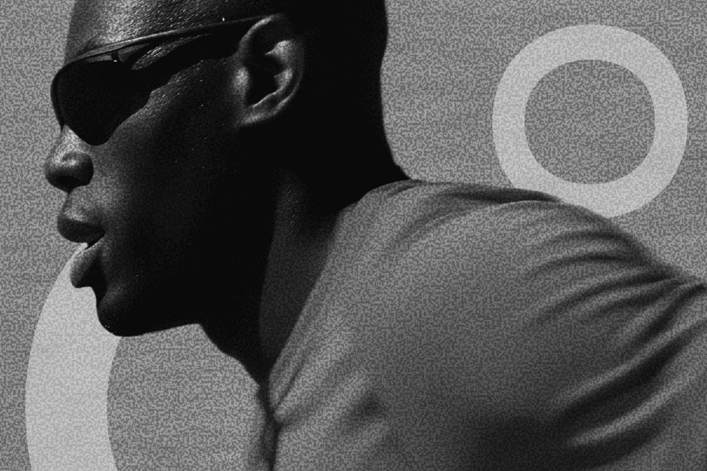
IIDE Type: Educational Institution Branding Objective: Creation of Branding Collaterals Target Audience: Prospective students Our agency had the pleasure of working on a concise yet impactful project for IIDE, where we focused on enhancing their branding collateral through Editorial Communication Design. Challenges Faced Visual Clarity: The need to present a wide array of programs in a clear and engaging manner. Brand Consistency: Ensuring that the new collaterals aligned with IIDE’s existing brand identity while standing out. Meraki’s Solution Visual Imagery and Copy: We crafted a brochure that beautifully merges striking visuals with meaningful content, effectively showcasing IIDE’s diverse programs. Clean and Elegant Design: The design was meticulously created to ensure clarity, making the information memorable and engaging for prospective students. Impact The result is a polished and professional brochure that not only highlights IIDE’s offerings but also reinforces its brand identity in a compelling way. https://merakidesign.in/wp-content/uploads/2023/10/Untitled-1-1.mp4
Wedding Card Design
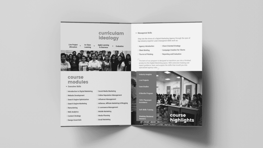
Wedding Card Design At Meraki Design Studio, designing wedding cards is much more than just a creative process—it’s a journey. A journey that begins with a simple conversation, where we sit down with the couple to understand: Who they are What they love What their dream wedding looks like. We take time to listen to their story, to feel the connection between them. From the moment we meet, we immerse ourselves in their world, finding ways to bring their vision to life. Whether it’s sleek and modern or rich in tradition, we translate their personalities into a card that feels uniquely theirs. Each card is thoughtfully created, with layers of meaning and emotion. The result? A collection of wedding cards, each with its own story to tell—a perfect beginning to a couple’s unforgettable day. traditional indian intricate grand wedding indian symbolism traditional indian intricate grand wedding indian symbolism traditional indian intricate grand wedding indian symbolism traditional indian intricate grand wedding indian symbolism modern traditional indian imagery dynamic vivid modern traditional indian imagery dynamic vivid modern traditional indian imagery dynamic vivid modern traditional indian imagery dynamic vivid minimal modern vibrant aesthetic minimal modern vibrant aesthetic minimal modern vibrant aesthetic minimal modern vibrant aesthetic pattern building detailed authentic indian imagery pattern building detailed authentic indian imagery pattern building detailed authentic indian imagery pattern building detailed authentic indian imagery
Formosa Floors
Formosa Floors Type: Premium SPC Flooring Brand Objective: Build a distinct identity and establish brand presence in a competitive flooring market through comprehensive branding, digital presence, and a robust marketing strategy Target Audience: Homeowners, interior designers, architects, and real estate developers Challenges Faced New Brand, Zero Awareness:Formosa was entering a saturated market with no prior digital or offline presence. Lack of Brand Identity:There was no logo, tone of voice, or visual guide— a complete brand build was required.Premium Offering, Low Familiarity:While SPC flooring is high-quality, the general audience was unfamiliar with its features and benefits. Highly Visual Industry:The brand needed to establish trust and aspiration in a segment driven by aesthetics and functionality. Meraki’s Solution End-to-End Branding:Developed a strong and luxe brand identity with a modern logo, refined typography, and a sophisticated visual palette to reflect Formosa’s premium positioning. Website Design & Development:Created a sleek, intuitive website that not only showcased products beautifully but also educated users about SPC flooring and its advantages. Social Media Launch & Strategy:Built their social media presence from scratch — with content pillars focused on product education, design inspiration, behind-the-scenes processes, and installation highlights. Visual Language:Focused on warm, homely visuals paired with clean, editorial design to appeal to both homeowners and professionals in the interiors space. Content Marketing:Developed engaging content formats including transformation posts, expert tips, and moodboard-style layouts to build aspiration and awareness. Impact Formosa Floors successfully transitioned from a new entrant to a recognizable name within the interiors community. The brand saw steady growth in engagement, inquiries, and collaborations — with a growing audience of design professionals and homeowners actively exploring their offerings. The cohesive visual identity and strategic online presence positioned Formosa as a premium, trustworthy choice in the SPC flooring category. https://merakidesign.in/wp-content/uploads/2023/11/Formosa-Logo-animation-v4.mp4https://merakidesign.in/wp-content/uploads/2023/11/v.mp4 https://merakidesign.in/wp-content/uploads/2023/11/posts.mp4https://merakidesign.in/wp-content/uploads/2023/11/Formosa-Book-Video-1.mp4
Maa-Corporate
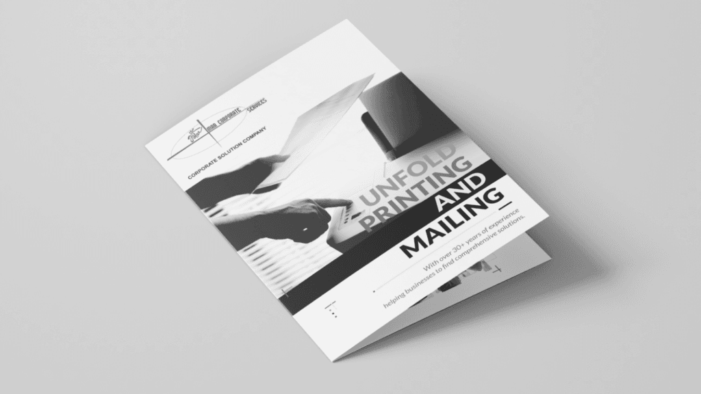
Maa Corporate Services Type: Printing and Mailing Company Brochure Objective: Editorial Brochure Design Target Audience: Corporate clients and businesses requiring printing and mailing solutions With over 40 years of expertise, Maa Corporate Services sought a brochure that captured the essence of their longstanding legacy in the printing industry. Challenges Faced Preserving Tradition: Designing a brochure that reflected the company’s rich history while also staying relevant in a modern context. Visual Balance: Balancing a vintage aesthetic with a contemporary touch to appeal to both traditional and modern clients. Showcasing Expertise: Effectively highlighting their printing expertise within the design, ensuring it resonated with their brand identity. Meraki’s Solution We crafted a tri-fold brochure with a vintage visual aesthetic, featuring black-and-white images from their factory to reflect the company’s legacy. To balance this, we incorporated a vibrant CMYK color palette as an ode to their renowned printing services, blending history with a modern, dynamic appeal. Impact The editorial brochure successfully communicated Maa Corporate Services’ legacy and expertise, helping to reinforce their position as a trusted name in the printing and mailing industry. It resonated with both existing and potential clients, effectively blending tradition with modern design elements.