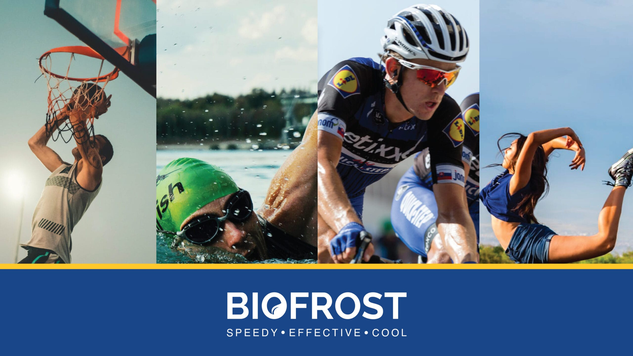
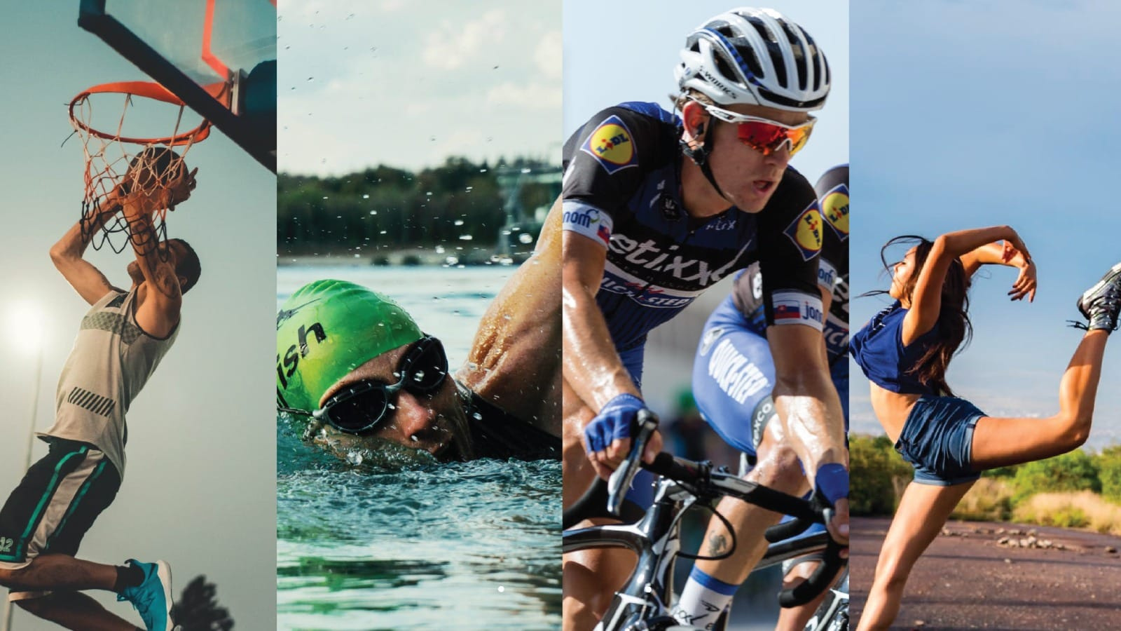
Market Positioning: Building awareness and trust in a new market segment in India.
Product Perception: Positioning Biofrost as a revolutionary pain therapy product, not medicinal.
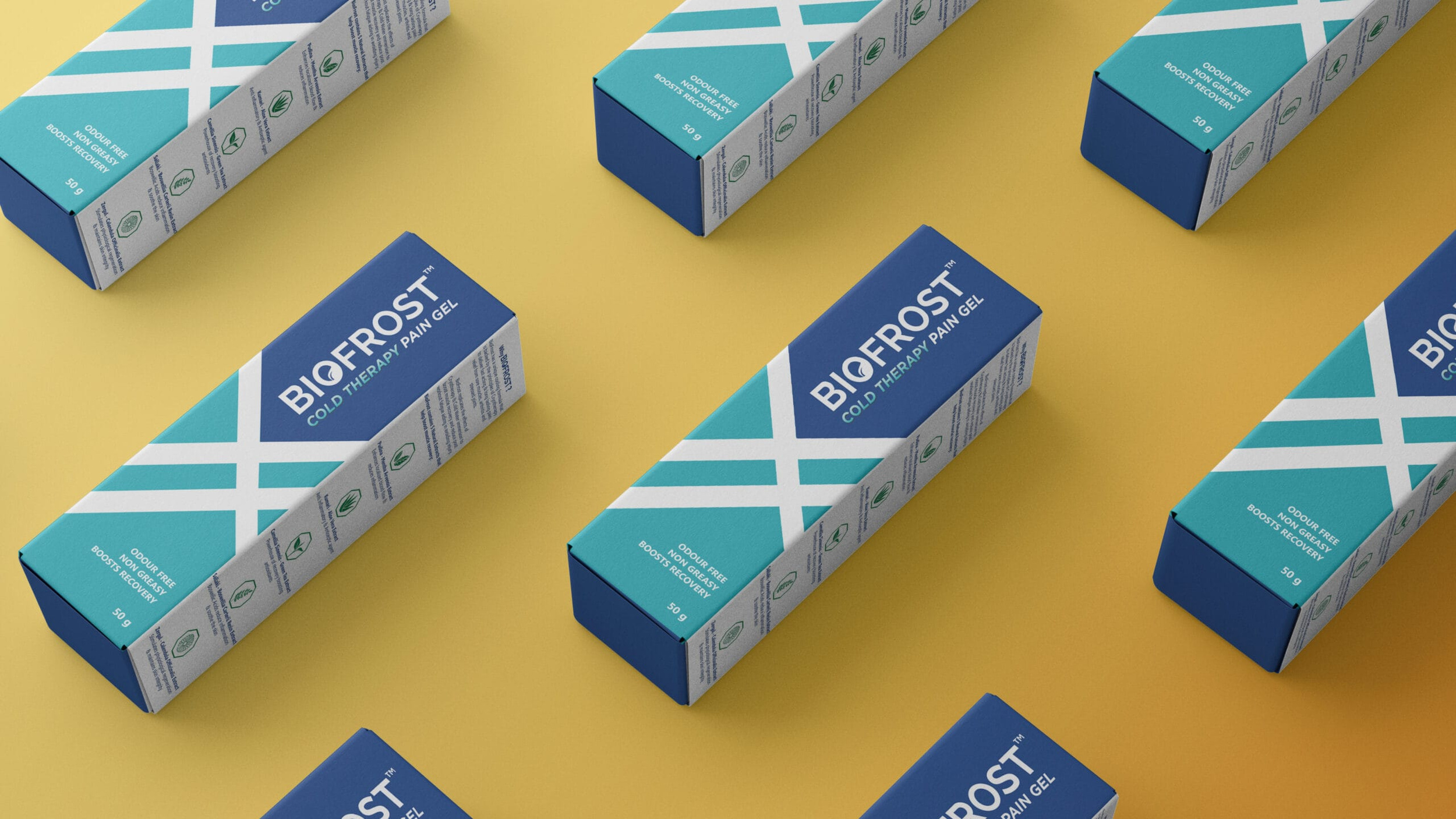
Packaging: Standing out among sports-related products on crowded shelves.
Meraki’s Solution
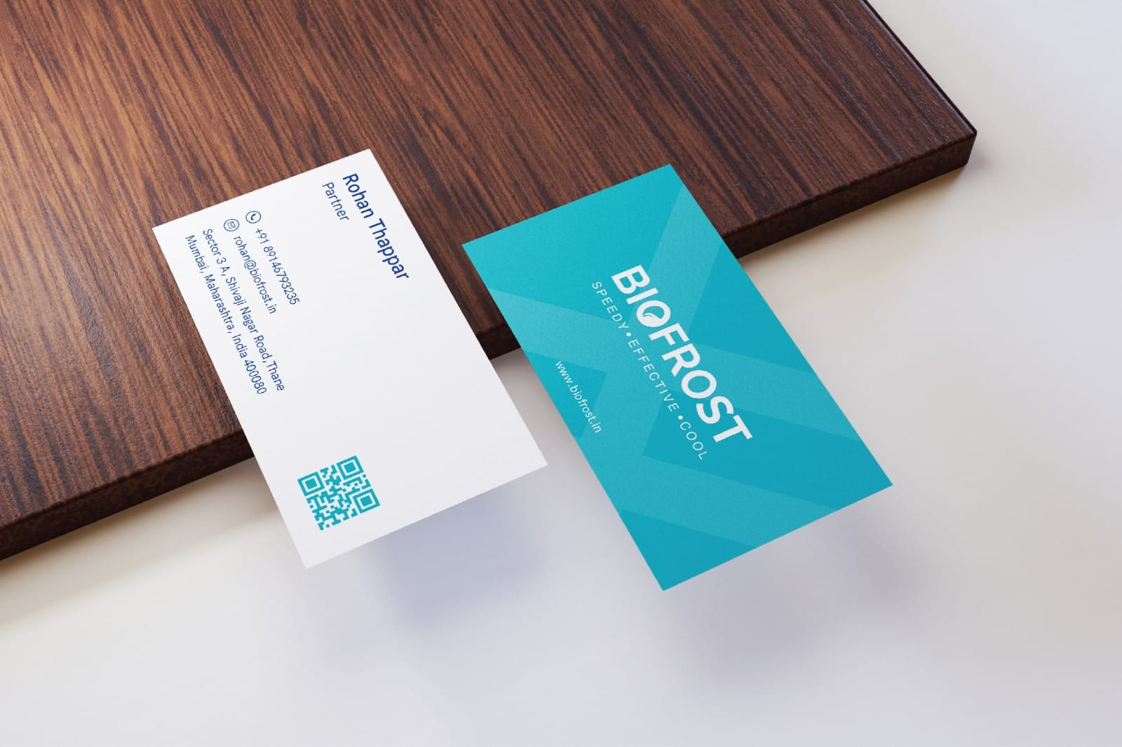
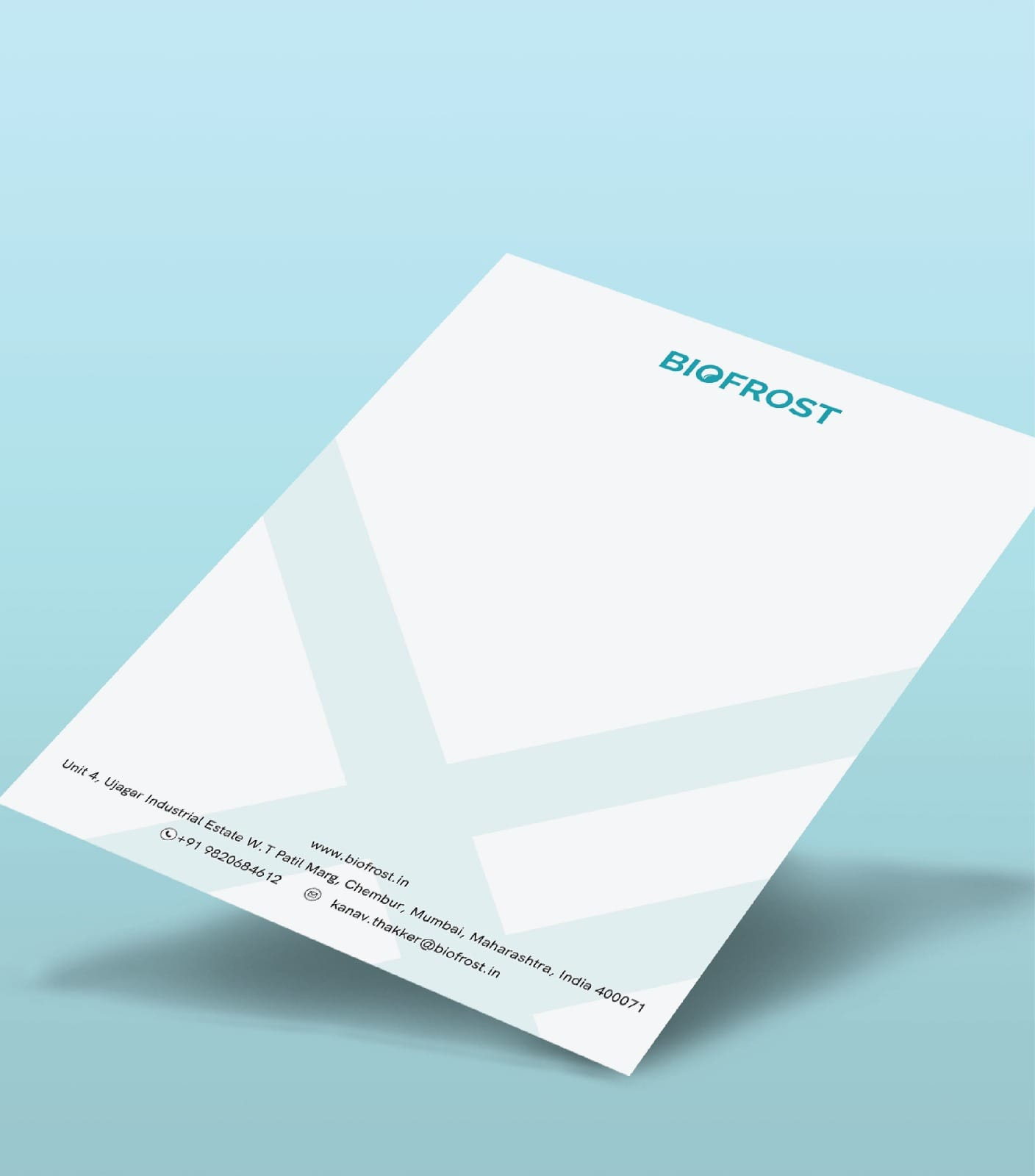
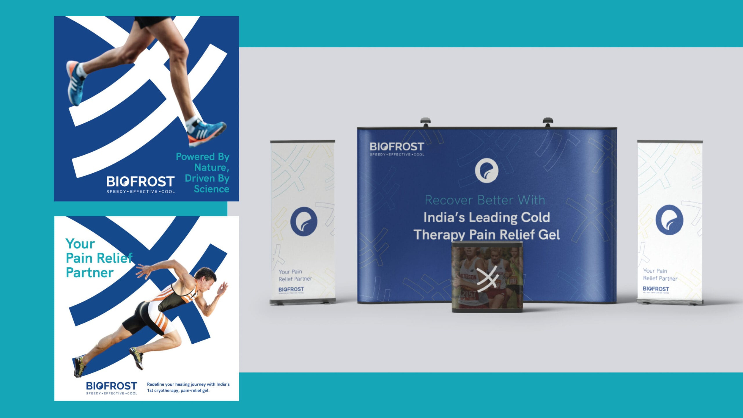
Branding: Developed a complete brand experience, from logo to guidelines, reflecting Biofrost’s innovation.
Packaging: Designed bold, bright geometric packaging to attract athletes and differentiate from competitors.
Visual Impact: Communicated cryotherapy’s innovation and effectiveness with attention-grabbing design.
Impact
Product sales increased by 20% in the competitive sports industry, driven by strategic branding and marketing efforts.
Successfully repositioned Biofrost from a medicinal pain relief gel to a premium cryotherapy solution for athletes.
Strategic marketing campaigns and bold packaging elevated Biofrost’s presence, driving both awareness and demand within the sports community.
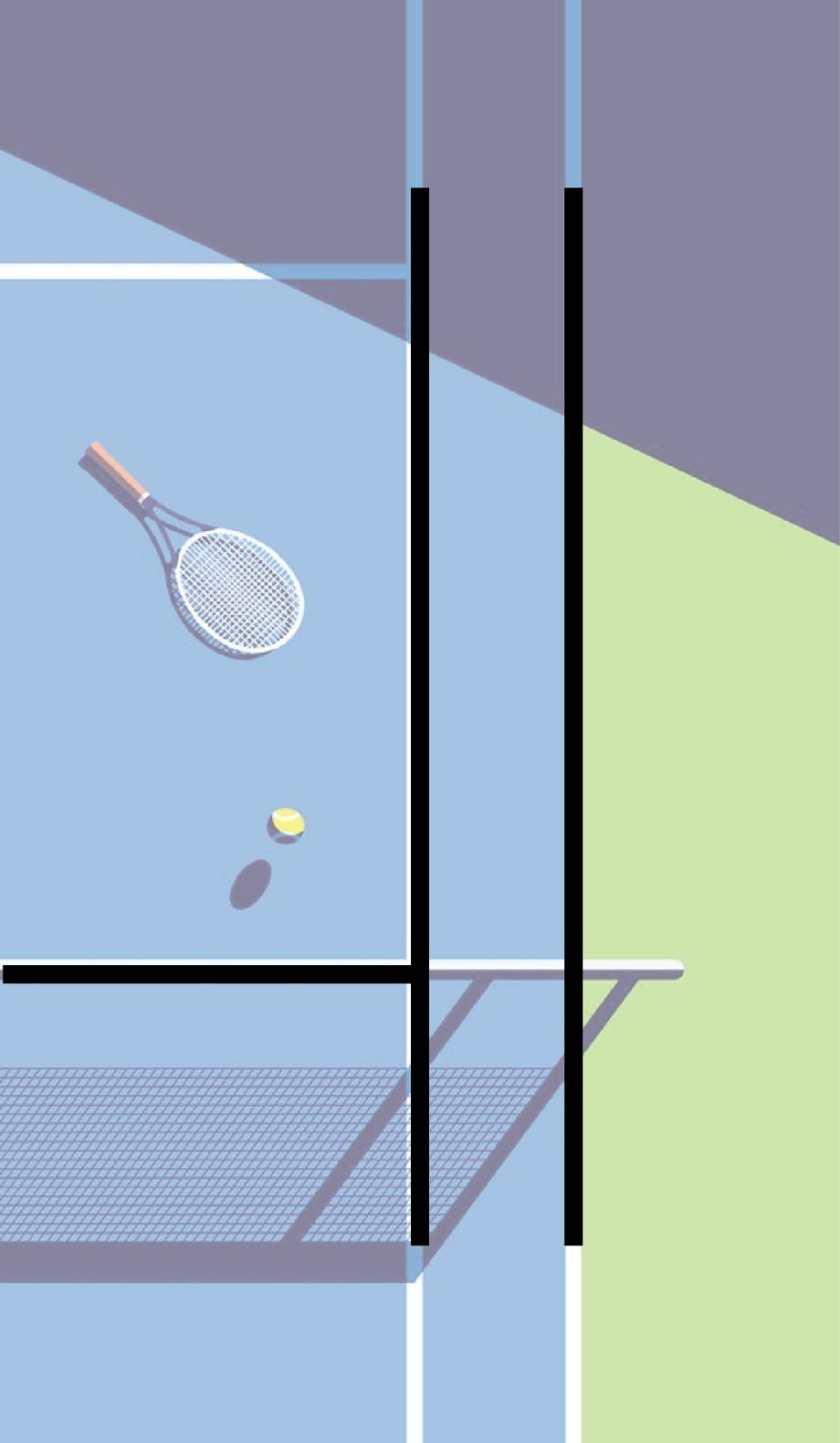
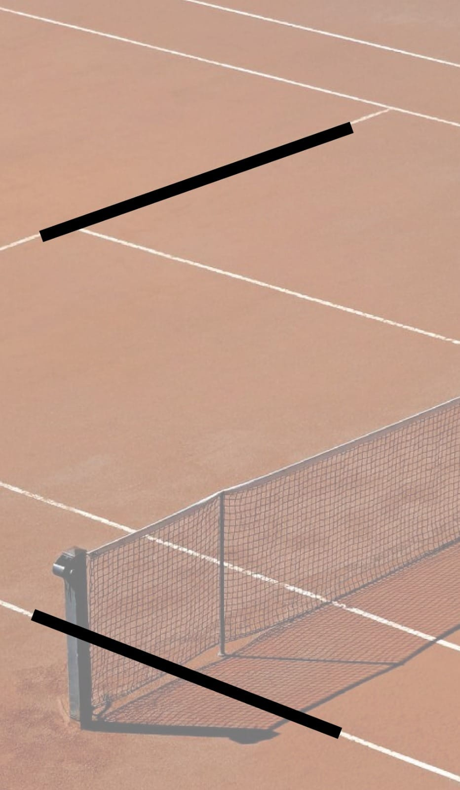
CONCEPT
With a designer’s eye for detail, the bold and sporty geometric pattern consisting of lines was unmissable.
It is a design element used across various sports such as tennis, football, rugby, cricket, and volleyball. Inspired by the design’s fun and sporty vibe, we have curated a graphic element for our product.
Brand EvolutionNew Visual ElementBrand EvolutionNew Visual Element
Brand EvolutionNew Visual ElementBrand EvolutionNew Visual Element