Gymtonico
Redefining fitness as a lifestyle, not a finish line.
Services
Brand Identity
Website Design & Development
Content Strategy
Brand Applications
Industry
Fitness & Lifestyle
Most fitness brands are built to shout. Before and afters, aggressive countdowns, a kind of communication that treats the body like a problem to be fixed fast. Gymtonico wanted none of that. It believed fitness could be something people return to, not something they white-knuckle through, and it needed a brand that actually looked like that belief.
Most fitness brands are built to shout. Before and afters, aggressive countdowns, a kind of communication that treats the body like a problem to be fixed fast. Gymtonico wanted none of that. It believed fitness could be something people return to, not something they white-knuckle through, and it needed a brand that actually looked like that belief.
The harder part was saying that without going soft. Lifestyle-led doesn't have to mean low-energy, and the identity needed to feel bold enough to hold its own in a category built on intensity, just without borrowing intensity's usual visual language.
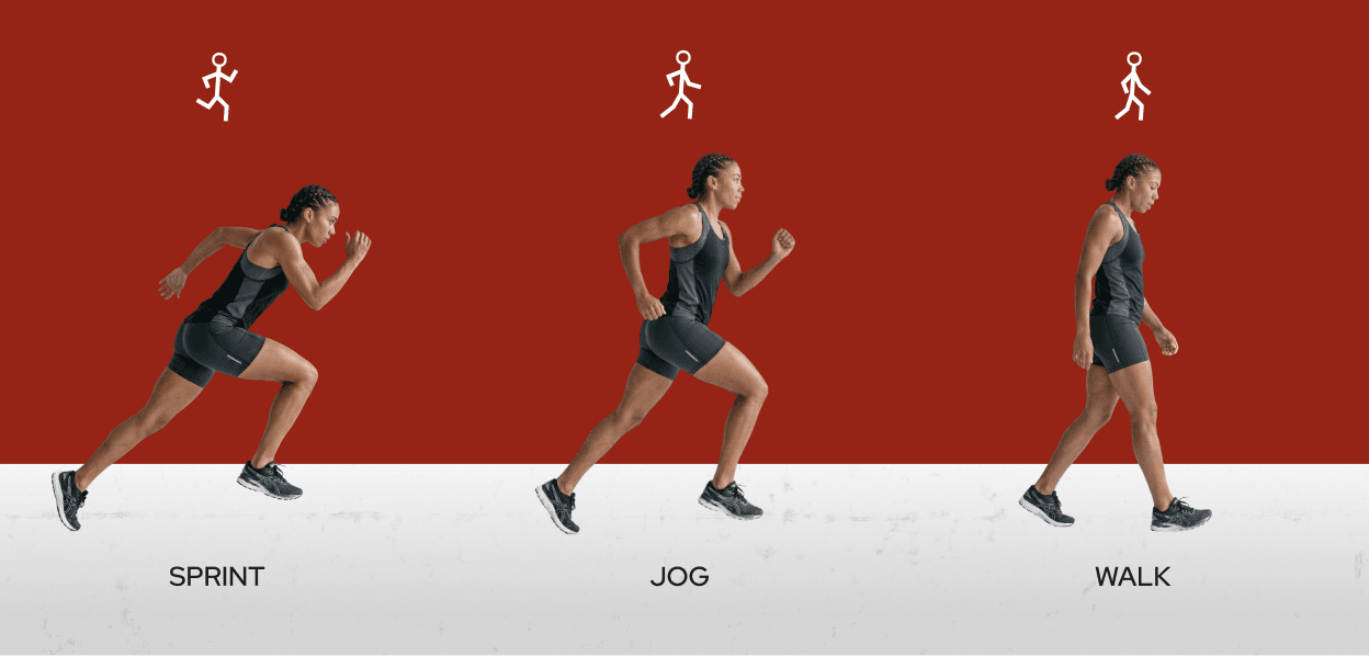
We built the mark from circles and lines, geometry precise enough to scale from a gym wall to a favicon without losing its shape. Around it, a visual system carries motion and realism rather than polish, photography that looks like effort rather than performance, a palette and pattern language built to feel fluid instead of forced.
The voice needed the same restraint. Short, sharp phrases like "Break The Flow" carry the energy without tipping into the aggressive fitness cliché Gymtonico was moving away from, confident enough to motivate, relaxed enough to feel like it's talking with you rather than at you. That tone runs through the website too, where the messaging leans into community and consistency over transformation, positioning Gymtonico as something closer to a rhythm you keep than a program you finish.
Every touchpoint after that, merchandise, in-gym signage, social templates, carries the same DNA, built to flex across a hundred small moments without losing the thread.
The result is a brand that doesn't need to raise its voice to be heard.