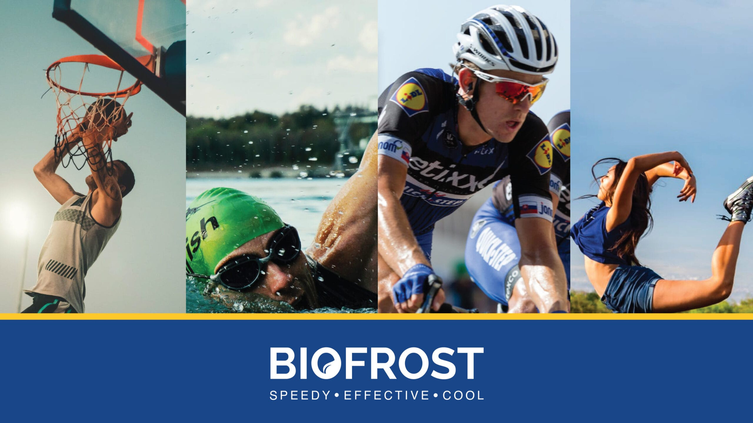
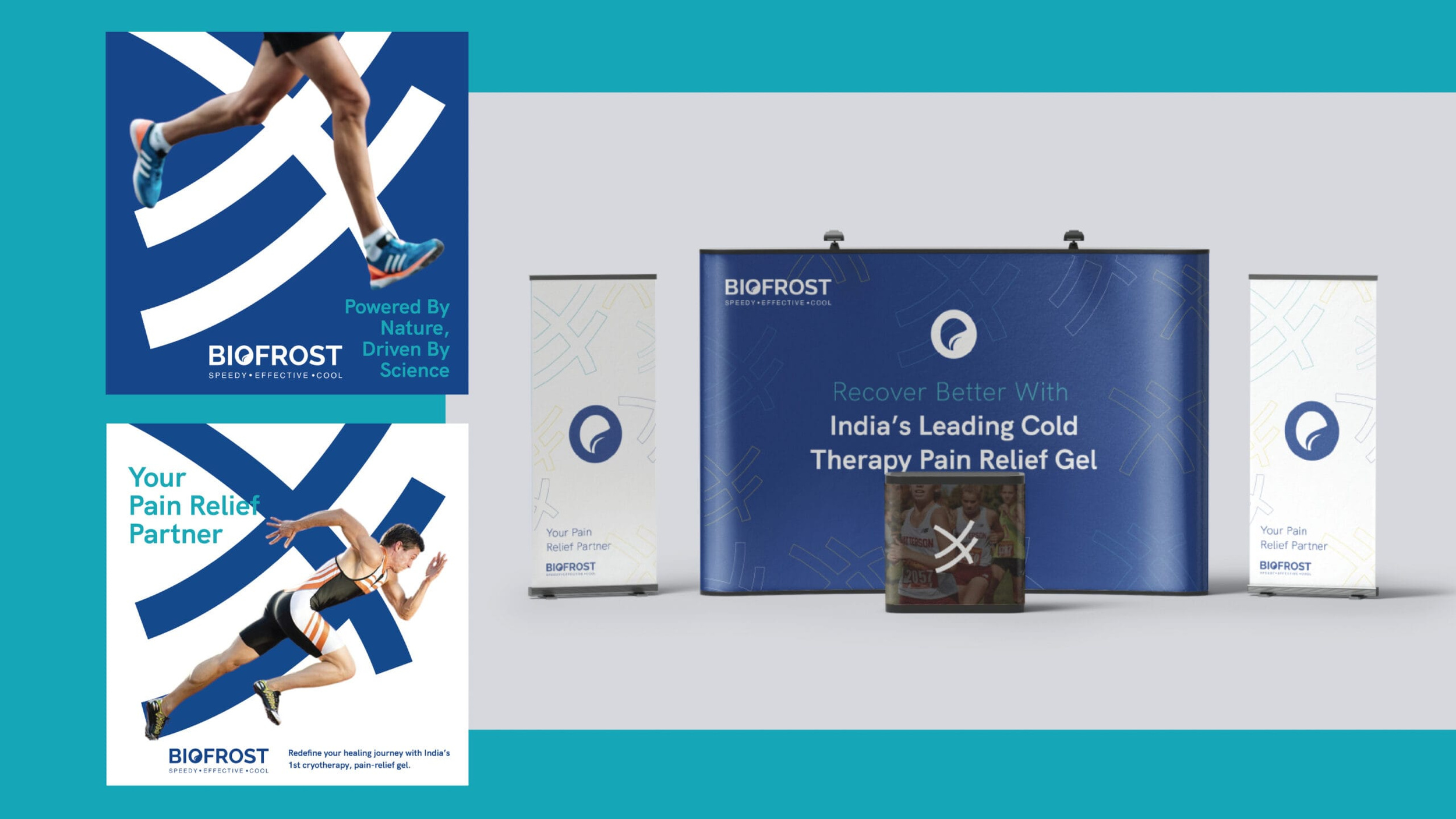
India treats pain with heat. Warming balms, strong smells, the familiar burn that tells you the medicine is working. Biofrost arrived selling the opposite: cold. A gel built on the principles of cryotherapy, using cold sensation to block pain signals to the brain, made with natural botanicals.
Which created a very specific branding challenge. In a market with no established cryotherapy category, every default would pull Biofrost toward the medicinal shelf, another tube for aching joints, when its real audience was the runner icing a knee, the lifter recovering between sessions, the athlete for whom cold is already a ritual. The brand had to be built to land in the gym bag, not the medicine cabinet.
So we built it for that athlete from the ground up. From logo to guidelines, the complete brand experience was designed around what makes Biofrost genuinely different: cryotherapy as innovation, not medication. A product for people who train needs the language of performance, recovery, readiness, the ice-pack feeling in a tube.
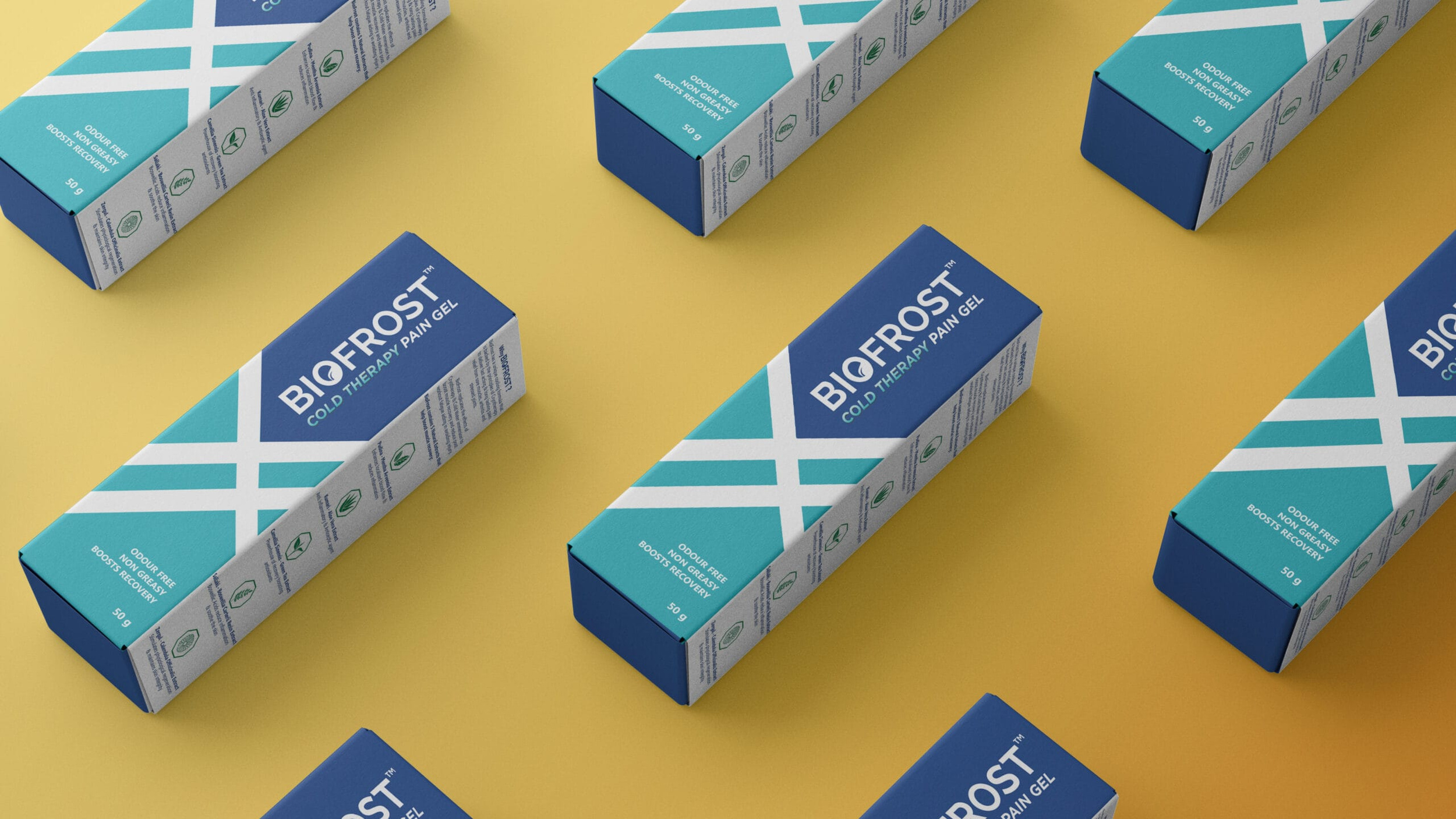
Packaging carried that positioning onto the shelf. Sports retail is a loud place, so we made Biofrost loud in the right way: bold, bright, geometric design that reads as sports gear rather than pharmaceutical packaging, and signals cold before you've read a word. In a category of muted tubes, it looks like it belongs to a different, more interesting aisle. Which was exactly the point.
The results proved the positioning. Sales grew 20 percent in a fiercely competitive sports market. Biofrost is now firmly perceived as a premium cryotherapy solution for athletes rather than a medicinal pain relief gel, and strategic campaigns paired with the bold packaging lifted both awareness and demand across the sports community.
Every brand in the category promises relief. Biofrost promises you'll be back on the field tomorrow.