Mantra Resources
Bringing clarity to an industry built on complexity.
Services
Brand Identity
Logo System
Visual Language
Brand Applications
Industry
Metals & Chemicals
Mantra Resources, B2B specialists in Metals & Chemicals, has spent years earning trust the unglamorous way, through precision, reliability, and the kind of technical knowledge that manufacturers and distributors come to depend on. That expertise never needed a visual identity to prove itself. Clients already knew.
Mantra Resources, B2B specialists in Metals & Chemicals, has spent years earning trust the unglamorous way, through precision, reliability, and the kind of technical knowledge that manufacturers and distributors come to depend on. That expertise never needed a visual identity to prove itself. Clients already knew.
But the industry around Mantra Resources speaks in a single dialect. Metallic gradients, heavy type, the same handful of blues, repeated across nearly every competitor's stationery and site. Standing for precision is not the same as looking distinct, and Mantra Resources had outgrown its visual language.
The opportunity wasn't to make an industrial company feel more modern. It was to express technical credibility without relying on the visual language the industry had come to expect.
We built the identity around balance and structure. The mark is constructed from controlled geometry and modular form, interlocking the way a well-engineered system does, with just enough movement to keep it from feeling static.
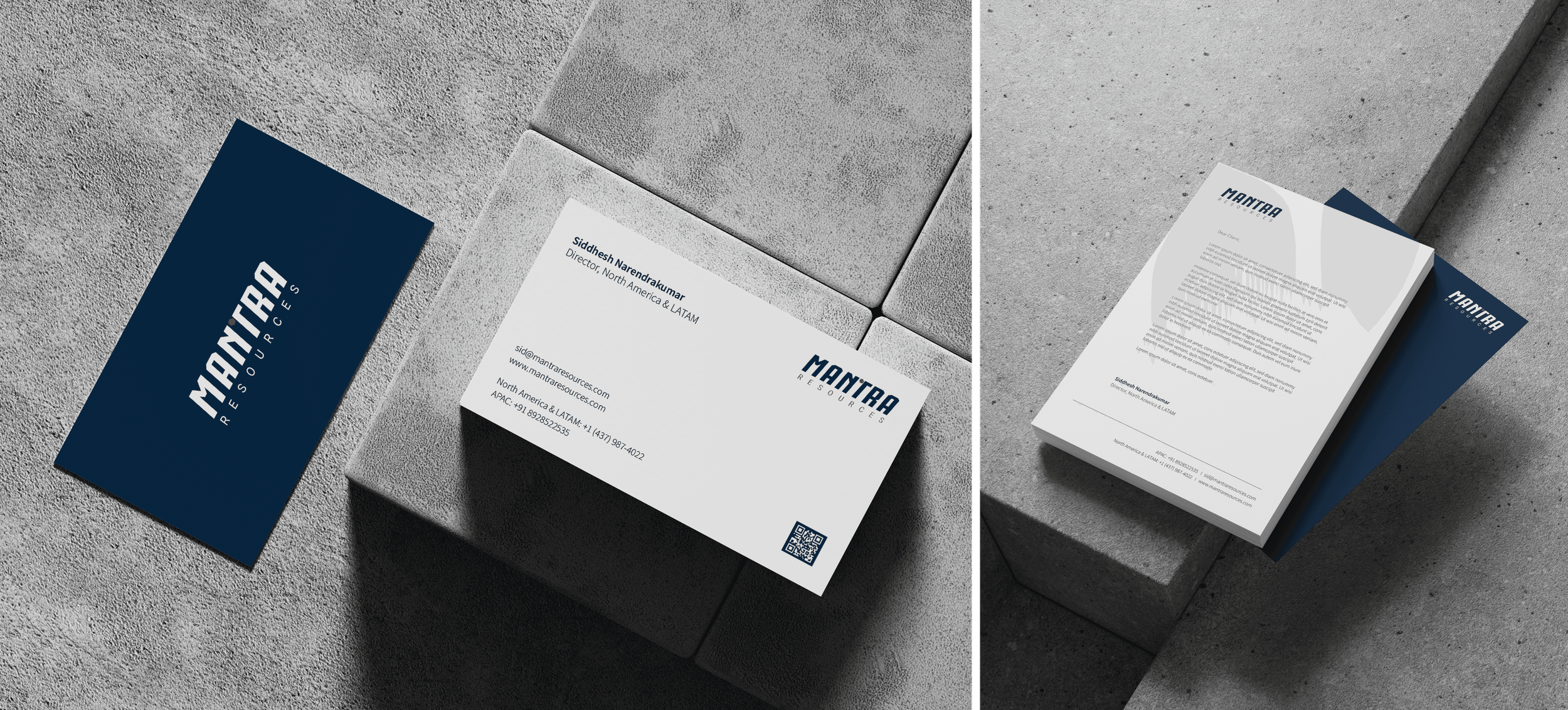
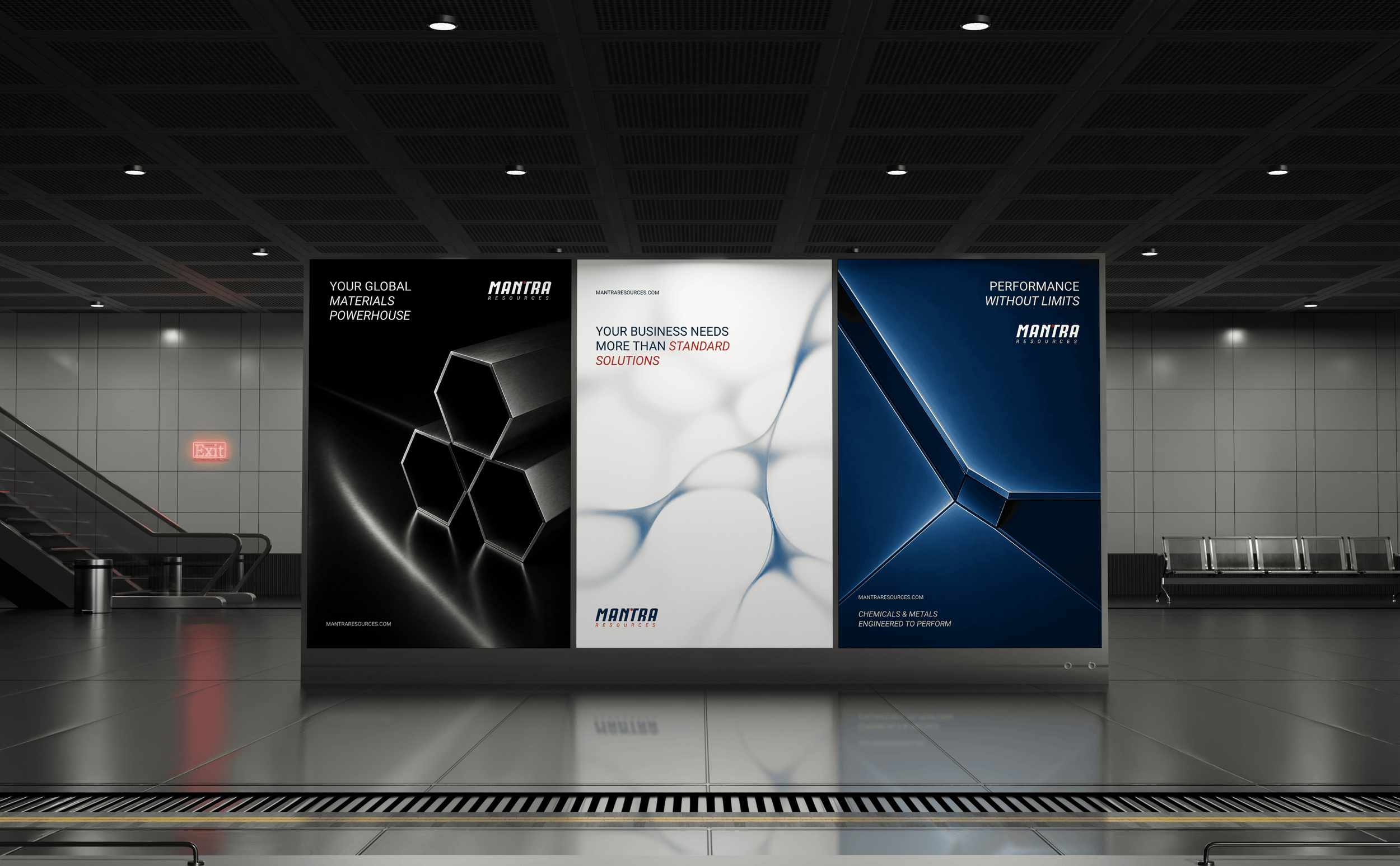
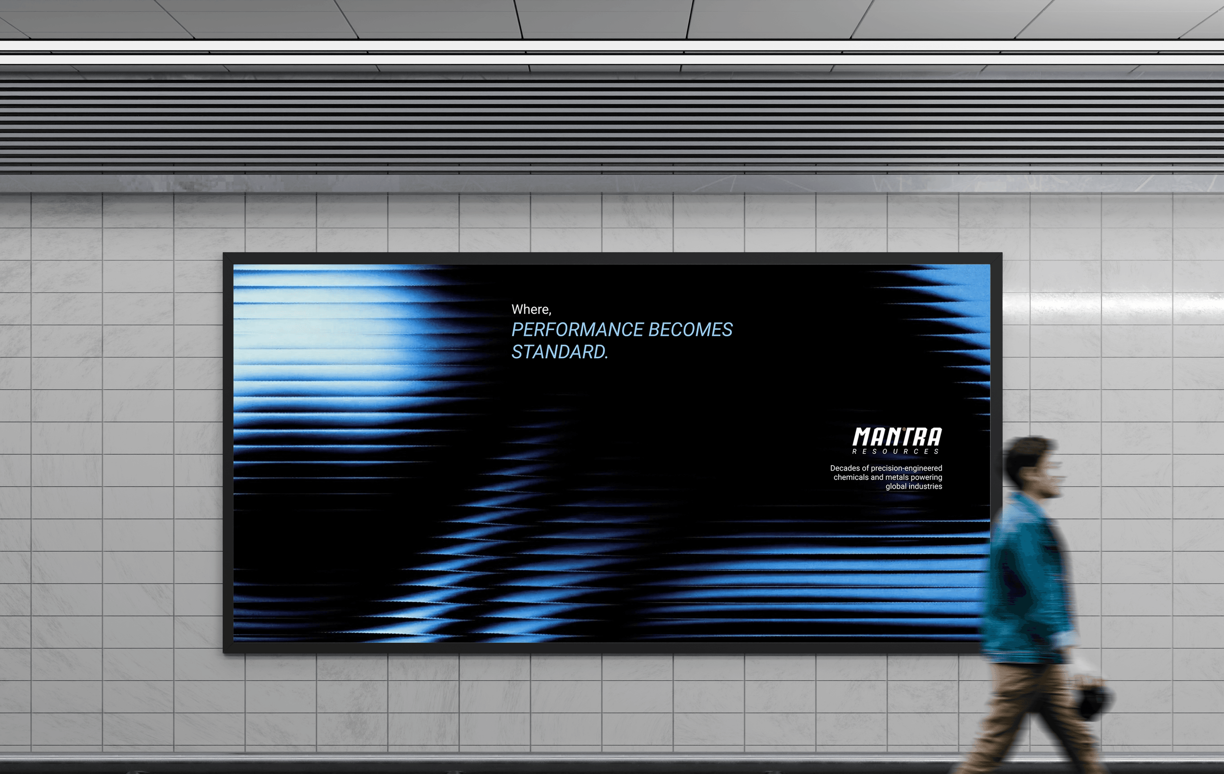
Typography carries the same discipline, confident and dependable, with a quiet forward lean built into its spacing rather than its shapes. The palette stays restrained, anchored in deep industrial blue, with accents placed carefully enough to support the structure instead of competing with it. That system now moves across stationery, presentations, documentation, and digital platforms without losing its shape, whether the application is a single business card or a hundred-page technical deck.
Mantra Resources now looks like what it has always been: precise, engineered, and impossible to mistake for anyone else in the room.
Precision, now visible.