Tangy Tongue
- Type: Spicy Schezwan Dip Branding
- Objective: Stand out in a crowded market through bold branding
- Target Audience: Food lovers seeking authentic, fiery flavors
Tangy Tongue, a new contender in the world of dips, wanted to make an unforgettable impression by emphasizing its unmatched, authentic flavor. The challenge was to create a brand identity that reflected its fiery personality.
Challenges Faced
- New Market Entry: Competing against well-established giants in the dip market.
- Conveying Flavor: Translating the unique, multi-layered taste profile into a visual identity that communicates the product’s boldness and excitement.
- Shelf Presence: Designing packaging that instantly grabs attention and signals the fiery heat inside.
Meraki’s Solution
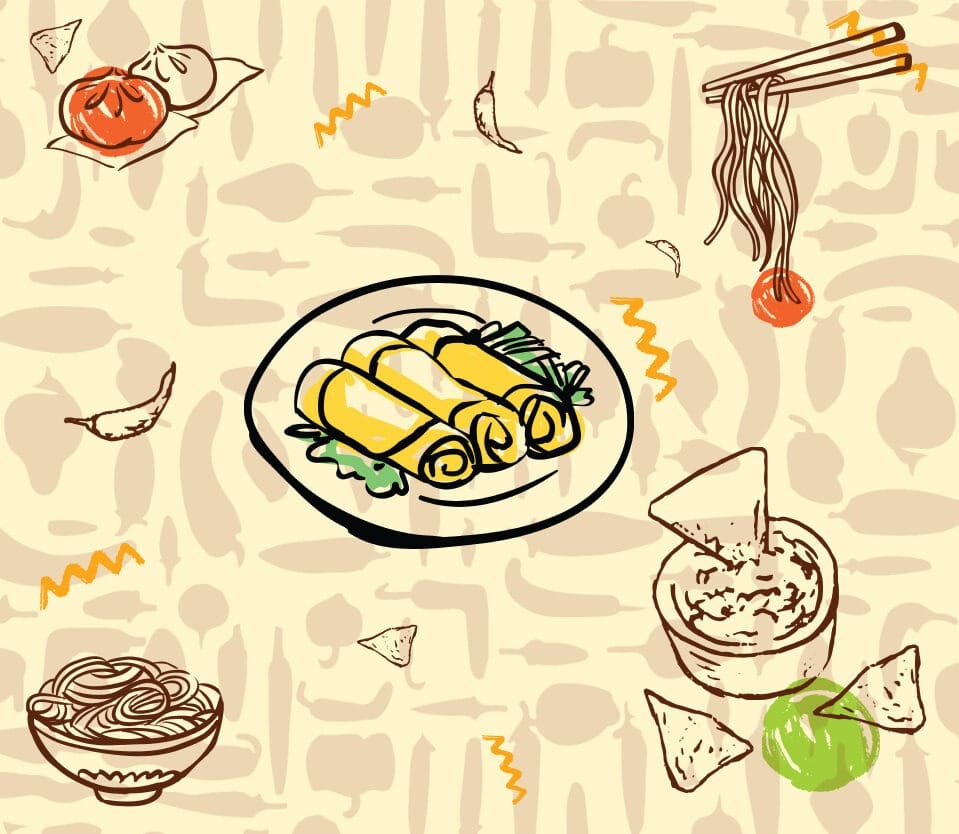
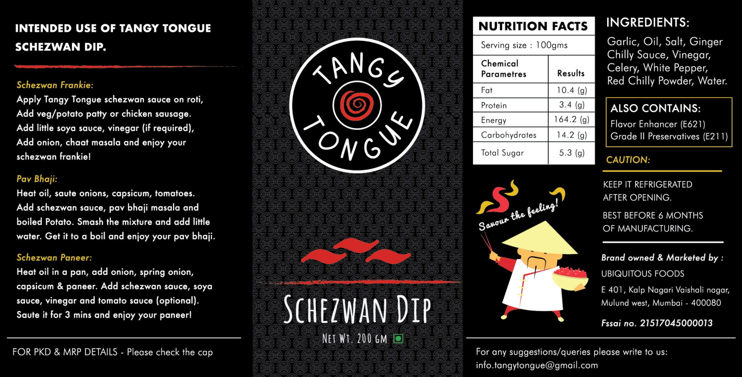
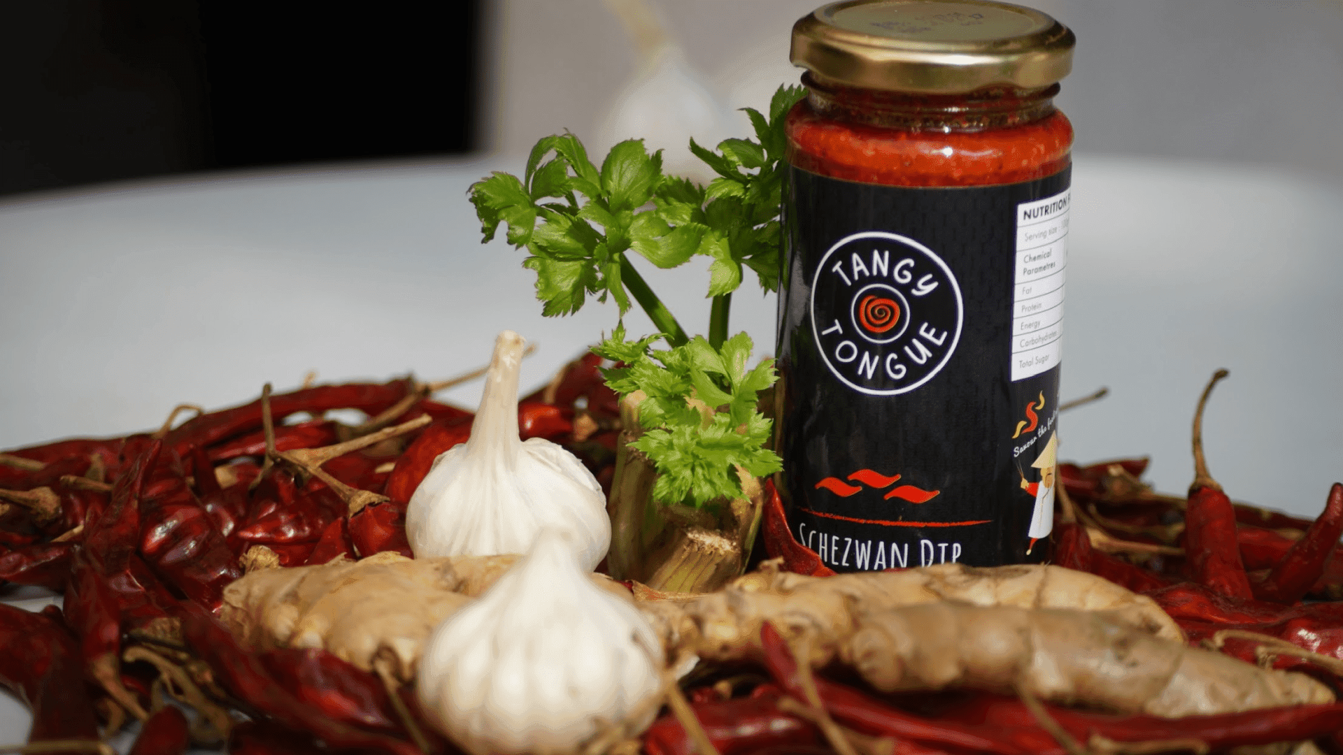
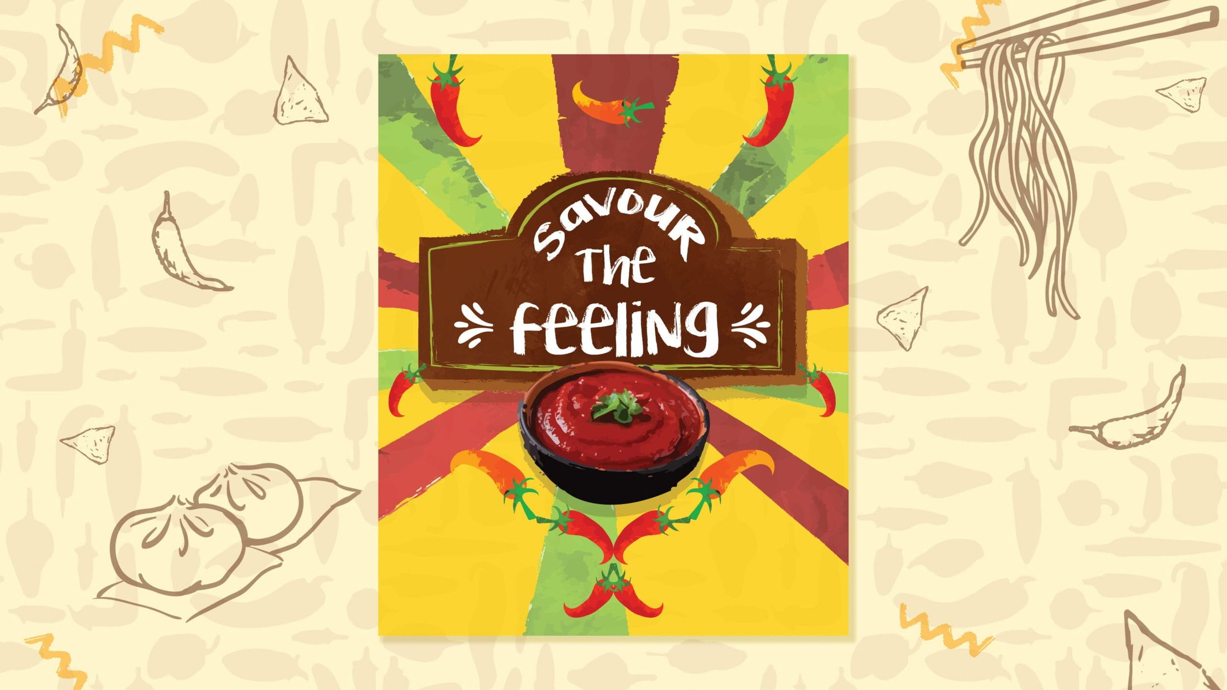
We created a dynamic brand identity, incorporating a swirly element in the logo to represent the rollercoaster of flavors – sweet, spicy, tangy, and hot! After all, this sauce is the boss! The logo’s twirls symbolize the exciting journey each taste bud will embark upon. To emphasize the heat, red chili illustrations were added to the packaging, giving a hint of the spicy adventure that awaits.
Impact
The bold, flavorful branding helped Tangy Tongue carve out its own space in the competitive dip market, with the packaging and visual identity drawing customers eager for an exciting and authentic taste experience. The unique packaging also contributed to a 35% increase in sales